|
IRISLIB database
|


|
|
IRISLIB database
|
|
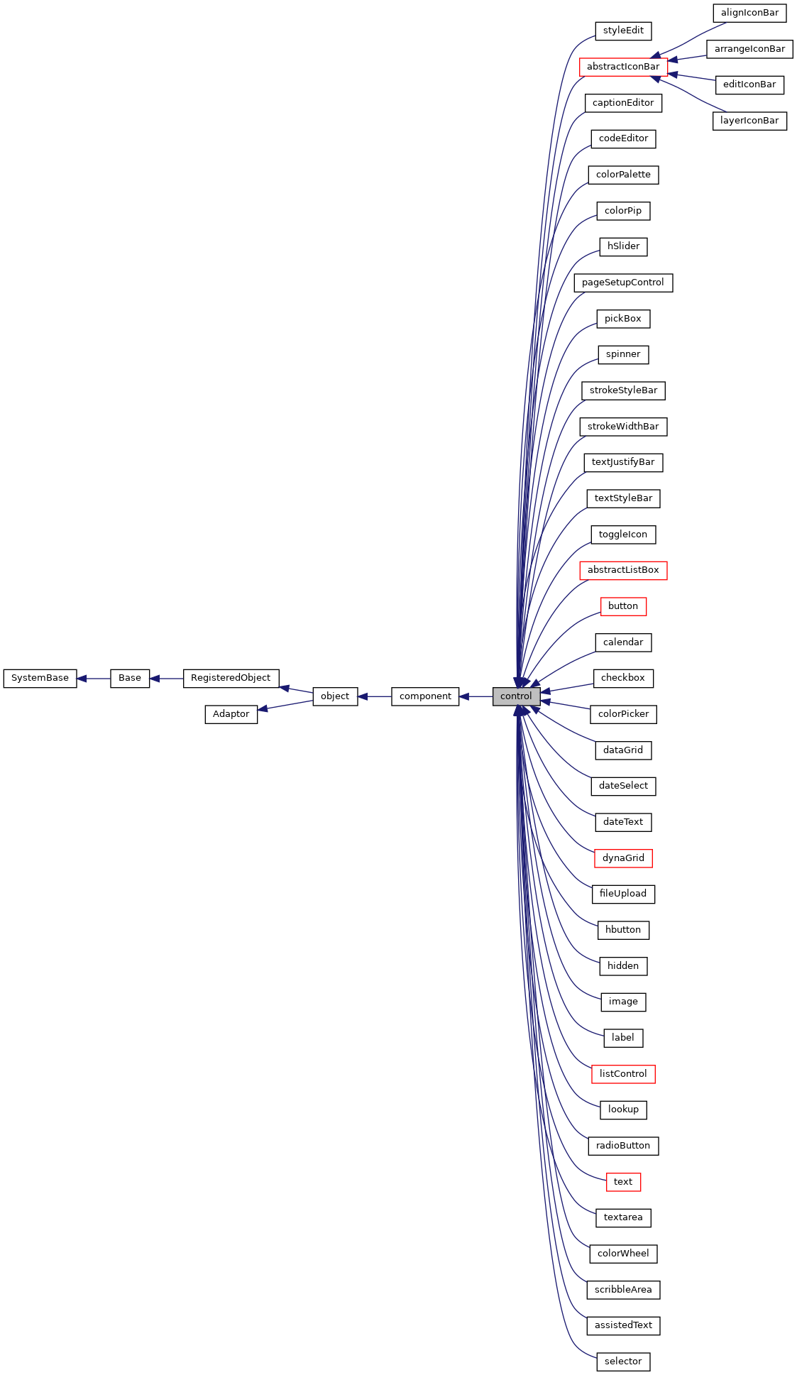
Base class for controls. More...
Public Member Functions | |
| dragStartHandler (dragData) | |
| Default drag handler for controls. | |
| dropStartHandler (dragData) | |
| Default drop handler for controls. | |
| focus () | |
| Client-side method to give input focus to this control. | |
| formatValue (val) | |
| If defined, convert the internal value of this control into a display value. | |
| _.Library.Boolean | getDisabled () |
| Client-side method to get the disabled state of this control. | |
| getDragData (dragData) | |
| Fill in the zenDragData object for this control. More... | |
| getForm () | |
| Find the form object that this control belongs to. More... | |
| getInvalidReason () | |
| This method is called by the form validation mechanism. More... | |
| _.Library.String | getProperty (property, key) |
| Override to get current value of control. | |
| _.Library.Boolean | getReadOnly () |
| Client-side method to get the disabled state of this control. | |
| _.Library.String | getValue () |
| Client-side method to return the value associated with this control. | |
| isModified () | |
| Return true if the current value of this control is different. More... | |
| isValid () | |
| This method is called by the form validation mechanism to test. More... | |
| _.Library.String | normalizeValue (val) |
| Normalize the type of val based on the <property>clientType</property> More... | |
| onSerialize () | |
| This is called when the client serializes this object. More... | |
| onchangeHandler () | |
| This built-in event handler is called by the HTML control. More... | |
| select () | |
| Client-side method to select the contents of this control. | |
| setDisabled (flag) | |
| Client-side method to set disabled state of this control. | |
| setProperty (property, value, value2) | |
| Set the value of a named property. More... | |
| setReadOnly (flag) | |
| Client-side method to set disabled state of this control. | |
| setValue (value, value2) | |
| Client-side method to set the value associated with this control. More... | |
| sysName () | |
| Client-side version of the <method>Name</method> method. More... | |
| unformatValue (val) | |
| If defined, convert display value of this control to its internal value. | |
| validationHandler () | |
| This client-side method is called by the form object's. More... | |
 Public Member Functions inherited from component Public Member Functions inherited from component | |
| dragFinishHandler (dragData) | |
| This is called when a drag operation started within this component. More... | |
| dragHandler () | |
| This is called by the layout manager when a drag-and-drop operation. More... | |
| dragNotifyHandler (dragData) | |
| This is called by the layout manager when a drag operation. More... | |
| dropHandler () | |
| This is called by the layout manager when a drag-and-drop operation. More... | |
| exposeComponent () | |
| This manages the ondisplay event callback handling. More... | |
| getEnclosingDiv () | |
| Client-side method returns the div element that encloses. More... | |
| _.Library.String | getHidden () |
| Return whether this component is hidden. | |
| getHintElement () | |
| Client-side method returns the HTML element that displays. More... | |
| getLabelElement () | |
| Client-side method returns the HTML element that displays. More... | |
| onDisplayHandler () | |
| This client callback is called from exposeComponent after. More... | |
| onEndModalHandler (zindex) | |
| Notification that this component is about to stop being modal. | |
| onPopupAction (popupName, action, value) | |
| This client event, if present, is fired when a popup page has specified. More... | |
| onRefreshContents () | |
| This client callback is called just from refreshContents. More... | |
| onStartModalHandler (zindex) | |
| Notification that this component is about to become modal. More... | |
| refreshContents (sync) | |
| This method, called from a client page, invokes this component's. More... | |
| setHidden (flag) | |
| If flag is true, hide this component. More... | |
| setOverlayMode (mode) | |
| Expirimental: do not use. More... | |
| startProgressBar (div) | |
| Start the display of a progress bar within display. More... | |
| stopProgressBar () | |
| Stop the timer used by the Progress bar. | |
| Public Member Functions inherited from object | |
| _.Library.Status | OnNew (_.Library.RawString initvalue) |
| Constructor for Zen objects. More... | |
| findElement (subid) | |
| Client-side utility method that finds an HTML element with a. More... | |
| fireOnUpdateEvent () | |
| This is called when an object is updated from the server. More... | |
| getSettings (settings) | |
| Client-side method that returns a list of this component's. More... | |
| getType () | |
| Returns the component type of this object. More... | |
| invokeSuper (method, args) | |
| Invoke the superclass method method of the current. More... | |
| isOfType (type) | |
| Returns true if this object is of the given component type. More... | |
| makeId (subid) | |
| client-side utility method that constructs a component-specific id More... | |
| onCreate () | |
| This client method, if present, is called when this component is. More... | |
| onDelete () | |
| This client method, if present, is called when this component is. More... | |
| onloadHandler () | |
| This client event, if present, is fired when the page is loaded. | |
| onunloadHandler () | |
| This client event, if present, is fired when the page is unloaded. More... | |
| onupdateHandler () | |
| This client method, if present, is fired when the object is updated from the server. | |
| render () | |
| This causes a component that draws its contents dynamically. More... | |
| renderContents () | |
| This method, if present, is called when this component. More... | |
| renderSVG (document, parent) | |
| This method is only needed for SVG components. More... | |
| Public Member Functions inherited from RegisteredObject | |
| _.Library.Status | OnAddToSaveSet (_.Library.Integer depth, _.Library.Integer insert, _.Library.Integer callcount) |
| This callback method is invoked when the current object is added to the SaveSet,. More... | |
| _.Library.Status | OnClose () |
| This callback method is invoked by the <METHOD>Close</METHOD> method to. More... | |
| _.Library.Status | OnConstructClone (_.Library.RegisteredObject object, _.Library.Boolean deep, _.Library.String cloned) |
| This callback method is invoked by the <METHOD>ConstructClone</METHOD> method to. More... | |
| _.Library.Status | OnNew () |
| This callback method is invoked by the <METHOD>New</METHOD> method to. More... | |
| _.Library.Status | OnValidateObject () |
| This callback method is invoked by the <METHOD>ValidateObject</METHOD> method to. More... | |
| Public Member Functions inherited from Adaptor | |
| _.Library.Status | XMLExport (_.Library.String top, _.Library.String format, _.XML.Namespaces namespaces, attrs, _.Library.String createId, _.Library.String typeAttr, oreflist, idlist, _.Library.String initialIndent, _.Library.Boolean local, _.Net.MIMEPart mimeAttachments) |
| Serialize an XML enabled class as an XML document and write. More... | |
| _.Library.Status | XMLExportToStream (_.Stream.Object export, _.Library.String top, _.Library.String format, _.XML.Namespaces namespaces, attrs, _.Library.String createId, _.Library.String typeAttr, oreflist, idlist, _.Library.String initialIndent) |
| Serialize an XML enabled class as an XML document and appends it to a stream. More... | |
| _.Library.Status | XMLExportToString (_.Library.String export, _.Library.String top, _.Library.String format, _.XML.Namespaces namespaces, attrs, _.Library.String createId, _.Library.String typeAttr, oreflist, idlist, _.Library.String initialIndent) |
| Serialize an XML enabled class as an XML document and write it to a string. More... | |
Public Attributes | |
| clientType | |
| Indicates the client-side (JavaScript) type that should be used for this control's value. More... | |
| controlClass | |
| Optional CSS class used for the primary HTML element displayed for this control. More... | |
| controlStyle | |
| Optional CSS style applied to the primary HTML element displayed for this control. More... | |
| dataBinding | |
| Optional. More... | |
| disabled | |
| If true, this control is disabled. More... | |
| invalid | |
| Set this true when the value of this control is known to be. More... | |
| invalidMessage | |
| Value displayed in alert box by the form <method>validate</method> More... | |
| onblur | |
| onblur event handler: More... | |
| onchange | |
| onchange event handler: More... | |
| onclick | |
| onclick event handler: More... | |
| ondblclick | |
| ondblclick event handler: More... | |
| onfocus | |
| onfocus event handler: More... | |
| onkeydown | |
| onkeydown event handler: More... | |
| onkeypress | |
| onkeypress event handler: More... | |
| onkeyup | |
| onkeyup event handler: More... | |
| onmousedown | |
| onmousedown event handler: More... | |
| onmouseout | |
| onmouseout event handler: More... | |
| onmouseover | |
| onmouseover event handler: More... | |
| onmouseup | |
| onmouseup event handler: More... | |
| onsubmit | |
| onsubmit event handler: More... | |
| ontouchend | |
| ontouchend event handler: More... | |
| ontouchmove | |
| ontouchmove event handler: More... | |
| ontouchstart | |
| ontouchstart event handler: More... | |
| onvalidate | |
| onvalidate event handler: More... | |
| originalValue | |
| Original value for this control before any user modification. More... | |
| readOnly | |
| If true, this control is readOnly. More... | |
| required | |
| If true, this control is required. More... | |
| requiredMessage | |
| Value displayed in alert box by the form <method>validate</method> More... | |
| tabIndex | |
| If defined, this is used to provide a value for the HTML tabIndex. More... | |
| value | |
| Default value displayed within this control. More... | |
| Public Attributes inherited from component | |
| align | |
| Specifies how this component should be horizontally aligned within its layout cell. More... | |
| containerStyle | |
| CSS style applied to the td element used to contain this child component within. More... | |
| dragEnabled | |
| If this value is true and dragAndDrop is enabled for the page, then. More... | |
| dropEnabled | |
| If this value is true and dragAndDrop is enabled for the page, then. More... | |
| enclosingClass | |
| Optional CSS class used for this component's enclosing div. More... | |
| enclosingStyle | |
| Optional CSS style applied to this component's enclosing div. More... | |
| error | |
| Run-time value; Set to indicate an error within this component. More... | |
| height | |
| Specifies the height of this component with respect to its container. More... | |
| hidden | |
| If true, this component is hidden. More... | |
| hint | |
| User defined hint text used to display additional hint text for this component. More... | |
| hintClass | |
| Optional CSS class used for the component hint. More... | |
| hintStyle | |
| User defined style used for the component hint. More... | |
| label | |
| User defined label used to label this component. More... | |
| labelClass | |
| Optional CSS class used for the component label. More... | |
| labelDisabledClass | |
| Optional CSS class used for the component label when disabled. More... | |
| labelStyle | |
| User defined style used for the component label. More... | |
| onafterdrag | |
| onafterdrag event handler: More... | |
| onbeforedrag | |
| onbeforedrag event handler: More... | |
| ondrag | |
| ondrag event handler: More... | |
| ondrop | |
| ondrop event handler: More... | |
| onhide | |
| onhide event handler: More... | |
| onrefresh | |
| onrefresh event handler: More... | |
| onshow | |
| onshow event handler: More... | |
| showLabel | |
| Controls whether a label is displayed for this component. More... | |
| slice | |
| User-defined number of units of relative space this. More... | |
| title | |
| Help text (tool tip) displayed when mouse hovers over this component (or its label). More... | |
| valign | |
| Specifies how this component should be vertically aligned within its layout cell. More... | |
| width | |
| Specifies the width of this component with respect to its container. More... | |
| Public Attributes inherited from object | |
| aux | |
| @qualifier final This is an auxiliary property that is provided More... | |
| composite | |
| @qualifier final For components that are created as part of a composite component, More... | |
| id | |
| @qualifier final This is a unique identifier that is used to distinguish this object More... | |
| index | |
| @qualifier final System-assigned index number used internally to identify this component. More... | |
| name | |
| @qualifier final Name of this object. More... | |
| onupdate | |
| onupdate event handler: More... | |
| parent | |
| @qualifier final Link to the component that contains this object More... | |
| tuple | |
| @qualifier final Special property indicating which tuple of a More... | |
| visible | |
| This property indicates whether a component is visible and thus layed out. More... | |
| window | |
| @qualifier final This is a client-only property that refers to the JavaScript More... | |
Static Public Attributes | |
| DEFAULTCLIENTTYPE = None | |
| Base class for controls. More... | |
| DEFAULTCONTROLCLASS = None | |
| The default css class used for the main element within this control. More... | |
| Static Public Attributes inherited from component | |
| DEFAULTENCLOSINGCLASS = None | |
| Subclasses can set this to change default enclosingClass used for this. More... | |
| DEFAULTHEIGHT = None | |
| Subclasses can set this to change default height for a component. | |
| DEFAULTHIDDEN = None | |
| Subclasses can set this to change default hidden property for a component. | |
| DEFAULTHINTCLASS = None | |
| Subclasses can set this to change default css class used for hints. | |
| DEFAULTLABELCLASS = None | |
| Subclasses can set this to change default css class used for labels. | |
| DEFAULTLABELDISABLEDCLASS = None | |
| Subclasses can set this to change default css class used for disabled labels. | |
| DEFAULTVISIBLE = None | |
| Subclasses can set this to change default visibilty for a component. | |
| DEFAULTWIDTH = None | |
| Subclasses can set this to change default width for a component. | |
| Static Public Attributes inherited from object | |
| DEFAULTVISIBLE = None | |
| Subclasses can set this to change default visibilty for a component. | |
| INCLUDEFILES = None | |
| CSV list of additional include files (either .js or .css) that. More... | |
| MODULE = None | |
| If set, this indicates that this system component should be. More... | |
| NAMESPACE = None | |
| This is the XML namespace used for library components. | |
| POSTCOMPILEACTIONS = None | |
| This is a comma-delimited list of which post-compile actions this component. More... | |
| USECOMMONDIRECTORY = None | |
| If true, then the include files generated for this component, are placed in the. More... | |
| XMLFORMAT = None | |
| If XMLFORMAT="Literal", then only support for literal format import and export is generated. More... | |
| XMLIGNOREINVALIDATTRIBUTE = None | |
| By setting this to 0, we disallow use of invalid attribute names in Zen XML documents. | |
| Static Public Attributes inherited from RegisteredObject | |
| CAPTION = None | |
| Optional name used by the Form Wizard for a class when generating forms. More... | |
| JAVATYPE = None | |
| The Java type to be used when exported. | |
| PROPERTYVALIDATION = None | |
| This parameter controls the default validation behavior for the object. More... | |
| Static Public Attributes inherited from Adaptor | |
| ATTRIBUTEQUALIFIED = None | |
| ATTRIBUTEQUALIFIED controls the format of exported XML by controlling whether attributes. More... | |
| ELEMENTQUALIFIED = None | |
| ELEMENTQUALIFIED controls the format of exported XML. More... | |
| NAMESPACE = None | |
| NAMESPACE specifies the XML namespace to be used when projecting the. More... | |
| SUPPRESSTYPEPREFIX = None | |
| SUPPRESSTYPEPREFIX allows the type name that refers to this class. More... | |
| XMLDEFAULTREFERENCE = None | |
| XMLDEFAULTREFERENCE specifies the default value of the XMLREFERENCE property parameter. More... | |
| XMLENABLED = None | |
| If this parameter is true then XML-enabling methods. More... | |
| XMLFORMAT = None | |
| The XMLFORMAT parameter controls the generation of the XMLExport and XMLImport. More... | |
| XMLIGNOREINVALIDATTRIBUTE = None | |
| The XMLIGNOREINVALIDATTRIBUTE parameter allows the programmer to control handling of unexpected. More... | |
| XMLIGNOREINVALIDTAG = None | |
| The XMLIGNOREINVALIDTAG parameter allows the programmer to control handling of unexpected. More... | |
| XMLIGNORENULL = None | |
| XMLIGNORENULL allows the programmer to override the default XML handling. More... | |
| XMLINCLUDEINGROUP = None | |
| XMLINCLUDEINGROUP allows the programmer to control whether a class is included. More... | |
| XMLINHERITANCE = None | |
| If the XMLINHERITANCE parameter is set to "LEFT", then in the case of multiple. More... | |
| XMLNAME = None | |
| This parameter provides the default XMLNAME for the class. More... | |
| XMLNIL = None | |
| The XMLNIL class parameter controls the use of xsi:nil by XMLExport. More... | |
| XMLNILNOOBJECT = None | |
| The XMLNILNOOBJECT parameter allows creation of an object to be skipped for elements. More... | |
| XMLPREFIX = None | |
| The XMLPREFIX parameter controls the prefix to be used for the XML namespace that. More... | |
| XMLSEQUENCE = None | |
| If the XMLSEQUENCE = 1, then the order of the XML elements must match the. More... | |
| XMLSUMMARY = None | |
| The summary fields to be used when an object is referenced are specified. More... | |
| XMLTYPE = None | |
| This parameter provides the default XMLTYPE for the class. More... | |
| XMLUNSWIZZLE = None | |
| If the XMLUNSWIZZLE parameter is set to 1, then single object. More... | |
| XMLUSEEMPTYELEMENT = None | |
| If the XMLUSEEMPTYELEMENT parameter is set to 1, then the empty element shorthand (<tag>) More... | |
Private Member Functions | |
| _.ZEN.Component.form | GetForm () |
| Server-side method. More... | |
| _.Library.String | Name () |
| Utility method used by subclasses to write out the. More... | |
| SetDefaultValues () | |
| This method fills in reasonable default values for. More... | |
Additional Inherited Members | |
| Static Public Member Functions inherited from Adaptor | |
| _.Library.Status | XMLDTD (_.Library.String top, _.Library.String format, _.Library.Boolean input, dtdlist) |
| Write the DTD to the current device for this XML enabled class serialized as. More... | |
| _.Library.RegisteredObject | XMLNew (_.XML.Document document, _.Library.Integer node, _.Library.RegisteredObject containerOref) |
| Get an instance of an XML enabled class. More... | |
| _.Library.Status | XMLSchema (_.Library.String top, _.Library.String format, _.Library.String namespacePrefix, _.Library.Boolean input, _.Library.Boolean refOnly, schema) |
| Write an XML Schema fragment to the current device which describes an XML enabled class and dependent classes. More... | |
| _.Library.String | XMLSchemaNamespace () |
| Get the namespace to which this class belongs for use in schema generation. More... | |
| _.Library.Status | XMLSchemaType (_.XML.Schema schemaInstance, _.XML.Node node, _.Library.String top, _.Library.Boolean encoded, _.Library.Boolean summary, _.Library.Boolean input, _.Library.Boolean refOnly) |
| Add a complexType to the schema that is respresented by an <class>XML.Schema</class> instance. More... | |
Base class for controls.
A control is a specialized type of component that can be placed within a form. Typically controls are used to allow the user to display and edit values (such as <class>text</class> controls) or to let the user take actions (such as <class>button</class> controls).
Most controls define a value (via the <property>value</property>) that is the data value associated with the control. This value can be submitted to the server as part of a <class>form</class> submit operation.
Controls define a set of common event handler properties, such as <property>onclick</property> that let you define a JavaScript expression that is executed when a given event occurs within the control.
Using the ZEN Model-View-Controller mechanism, you can bind data values to controls within a <class>form</class>. This provides a way to automatically set the value of a control to a property within a DataModel object.
Controls work together with a <class>form</class> to provide support for data validation and change tracking. Each control can define whether its current value is valid or not.
By default controls support drag-and-drop in the following way:
A drag from a control will drag the current value of the control.
A drop onto a control will set the current value of the control to the value of the drag data object. The text value is used if different than the logical value.
|
private |
Server-side method.
Find the form object that this control belongs to. Return "" if there is no form.
|
private |
Utility method used by subclasses to write out the.
nameattribute for the primary HTML element of this control.
Names are of the form: $V_id
If name starts with "IRIS" or "Cache" then it is assumed to be a built-in variable and is not escaped.
|
private |
This method fills in reasonable default values for.
this control. Used by tools (such as the Control Tester) to dynamically create controls.
Reimplemented in radioSet, radioButton, multiSelectSet, listBox, label, image, dynaGrid, dataListBox, dataCombo, combobox, checkbox, and button.
| getDragData | ( | dragData | ) |
Fill in the zenDragData object for this control.
This is called when a drag operation starts on this control. Subclasses can override this to provide customized behavior.
Reimplemented in image.
| getForm | ( | ) |
Find the form object that this control belongs to.
Return null if there is no form.
| getInvalidReason | ( | ) |
This method is called by the form validation mechanism.
in order to get an invalid message to display for this control.
This is called by the form's <method>validate</method> method after it has determined that this control has an invalid value.
| isModified | ( | ) |
Return true if the current value of this control is different.
than its orginal value.
Reimplemented in textarea.
| isValid | ( | ) |
This method is called by the form validation mechanism to test.
if the current contents of this control are valid.
Returns true if the control value is valid; false otherwise. Subclasses can override this to provide specific behavior.
The default behavior is to return true.
Reimplemented in dateText, and dateSelect.
| _.Library.String normalizeValue | ( | val | ) |
Normalize the type of val based on the <property>clientType</property>
of this control.
| onSerialize | ( | ) |
This is called when the client serializes this object.
This gives us a chance to make sure that the value property is updated to have the current value displayed within the control. This version will take care of this for native controls. Custom controls must either ensure that the value property matches the current value of the control or override this method.
Reimplemented from object.
Reimplemented in radioButton, label, and checkbox.
| onchangeHandler | ( | ) |
This built-in event handler is called by the HTML control.
associated with the control to raise notification that the control's value has changed.
Reimplemented in textarea.
| setProperty | ( | property, | |
| value, | |||
| value2 | |||
| ) |
Set the value of a named property.
Assume that subclasses that simply wrap HTML controls have named the control 'control' or else have overridden this method.
Reimplemented from component.
Reimplemented in selector, assistedText, scribbleArea, colorWheel, textarea, text, select, radioSet, radioButton, multiSelectSet, lookup, listControl, label, image, hbutton, fileUpload, dynaGrid, dateText, dateSelect, dataListBox, dataGrid, dataCombo, combobox, colorPicker, checkbox, calendar, button, abstractListBox, abstractComboBox, toggleIcon, textStyleBar, textJustifyBar, strokeWidthBar, strokeStyleBar, spinner, pickBox, hSlider, colorPip, colorPalette, codeEditor, captionEditor, abstractIconBar, and styleEdit.
| setValue | ( | value, | |
| value2 | |||
| ) |
Client-side method to set the value associated with this control.
value2 is an optional, second parameter used by some controls (such as <class>dataCombo</class>).
| sysName | ( | ) |
Client-side version of the <method>Name</method> method.
Use this to contruct control names when creating controls via DHTML that may be submitted by a Zen form.
| validationHandler | ( | ) |
This client-side method is called by the form object's.
<method>validate</method> to test if the contents of this control are valid.
This method does the following:
Readonly and disabled controls are always considered to be valid. A subclass can override this method to provide additional behavior, but the overridden method should perform the above actions.
Returns true if the control value is valid; false otherwise.
|
static |
Base class for controls.
A control is a specialized type of component that can be placed within a form. Typically controls are used to allow the user to display and edit values (such as <class>text</class> controls) or to let the user take actions (such as <class>button</class> controls).
Most controls define a value (via the <property>value</property>) that is the data value associated with the control. This value can be submitted to the server as part of a <class>form</class> submit operation.
Controls define a set of common event handler properties, such as <property>onclick</property> that let you define a JavaScript expression that is executed when a given event occurs within the control.
Using the ZEN Model-View-Controller mechanism, you can bind data values to controls within a <class>form</class>. This provides a way to automatically set the value of a control to a property within a DataModel object.
Controls work together with a <class>form</class> to provide support for data validation and change tracking. Each control can define whether its current value is valid or not.
By default controls support drag-and-drop in the following way:
A drag from a control will drag the current value of the control.
A drop onto a control will set the current value of the control to the value of the drag data object. The text value is used if different than the logical value.
The default value for the <property>clientType</property> property.
|
static |
The default css class used for the main element within this control.
This
is overridden by subclasses.
| clientType |
Indicates the client-side (JavaScript) type that should be used for this control's value.
By default controls treat their values as strings with no client-side normalization.
A control, or a page containing the control, can override this to indicate that this control displays a non-string value. The client-side logic will then try to convert the value to the appropriate client-side type whenever the value of the control is set.
Possible values are:
| controlClass |
Optional CSS class used for the primary HTML element displayed for this control.
| controlStyle |
Optional CSS style applied to the primary HTML element displayed for this control.
How, and whether, this CSS style is used is up to the actual control implementation.
This property is provided as a convenience. It is more typical to provide style information via a style sheet.
| dataBinding |
Optional.
If this control belongs to a form that is associated with
a dataController, this specifies the name of the property within the dataController that will provide the value for this control.
| disabled |
If true, this control is disabled.
| invalid |
Set this true when the value of this control is known to be.
invalid. Typically this is done by the form validation logic to to display this in a way that indicates it contains an invalid value.
| invalidMessage |
Value displayed in alert box by the form <method>validate</method>
method when the contents of this control are invalid.
This is a localized value.
| onblur |
onblur event handler:
This event is fired when the control loses focus.
| onchange |
onchange event handler:
This event is fired when the value of the control changes. Note that controls fire this event indirectly; the actual onchange event is sent to a built-in handler that notifies the form that owns this control of the modification.
| onclick |
onclick event handler:
This event is fired when the mouse is clicked on the control.
| ondblclick |
ondblclick event handler:
This event is fired when the mouse is double-clicked on the control.
| onfocus |
onfocus event handler:
This event is fired when the control is given focus.
| onkeydown |
onkeydown event handler:
This event is fired when a key is pressed when this control has focus.
| onkeypress |
onkeypress event handler:
This event is fired when a key is pressed when this control has focus.
| onkeyup |
onkeyup event handler:
This event is fired when a key is released when this control has focus.
| onmousedown |
onmousedown event handler:
This event is fired when a mouse button is released while within the area of the control.
| onmouseout |
onmouseout event handler:
This event is fired when the mouse pointer leaves the area of the control.
| onmouseover |
onmouseover event handler:
This event is fired when the mouse pointer enters the area of the control.
| onmouseup |
onmouseup event handler:
This event is fired when a mouse button is pressed while within the area of the control.
| onsubmit |
onsubmit event handler:
This event is fired when the form this control belongs to is submitted. This gives controls a chance to supply or modify the value they submit.
| ontouchend |
ontouchend event handler:
This event is fired on a touch screen device when the last figure or stylus breaks contact the screen at the end of a gesture.
| ontouchmove |
ontouchmove event handler:
This event is fired on a touch screen device when the one or more of the active contact points changes position as part of a gesture input.
| ontouchstart |
ontouchstart event handler:
This event is fired on a touch screen device when a figure or stylus initially contacts the screen within the area of the control.
| onvalidate |
onvalidate event handler:
This event is fired when this control's value is validated by its parent form. Return false if the value of this control is invalid.
| originalValue |
Original value for this control before any user modification.
It is used to detect which controls have been modified.
This is a special value in that it is automatically intialized when a form is displayed.
Do not use this property directly on the client; instead used the <method>getProperty</method> method.
Note that setting this on the client (via <method>setProperty</method>) will reset it to the current value of this control.
| readOnly |
If true, this control is readOnly.
| required |
If true, this control is required.
That is, a user must supply a
value for this control or the default form validation logic will fail.
| requiredMessage |
Value displayed in alert box by the form <method>validate</method>
method when this control is required and does not have a value.
This is a localized value.
| tabIndex |
If defined, this is used to provide a value for the HTML tabIndex.
attribute. This is used by the browser to control the tab order of controls within a form.
| value |
Default value displayed within this control.
This is a special value in that it is automatically intialized when a form is displayed.
Do not use this property directly on the client; instead used the <method>getValue</method> method to get the current value of a control.
 1.9.1
1.9.1