|
IRISLIB database
|


|
|
IRISLIB database
|
|
An editable grid control. More...
Public Member Functions | |
| _.Library.Status | OnNew (_.Library.RawString initvalue) |
| Constructor for Zen objects. More... | |
| adjustSizes () | |
| Adjust the column sizes of this grid. | |
| cellClickHandler (row, col, evt) | |
| User has clicked on a cell. | |
| cellDblClickHandler (row, col, evt) | |
| User has dbl-clicked on a cell. | |
| cellEditKeyHandler (evt) | |
| Process keys pressed within the grid's cell edit control. | |
| cellEditKeyUpHandler (evt) | |
| Process key up event within the grid's cell edit control. | |
| columnLabelDblClickHandler (col) | |
| User has double-clicked on a column label. | |
| columnLabelHandler (col) | |
| User has clicked on a column label. | |
| editCell (defval, which) | |
| Display edit control in the current cell. More... | |
| focus () | |
| Client-side method to input focus to this control. | |
| getCSSWidthSpec (node) | |
| Get the defined width of a node as specified in the CSS. | |
| getCellContents (data, r, c) | |
| Prepares data for display within a given cell. More... | |
| getCellEditor () | |
| Return the html element for the current cell editor, if there is one. | |
| getCellInfo (page, row, col) | |
| Return the cell descriptor for the given cell (if any). More... | |
| getCellProperty (pageno, rowno, colno, property) | |
| Get the value of a property for a cell descriptor of this grid. More... | |
| getCellValue (r, c) | |
| Return value of grid cell; Row and column are 1-based. | |
| getColumnCount () | |
| Return number of columns in this grid. | |
| getColumnInfo (c) | |
| Return an object containing display information for column c More... | |
| getColumnProperty (colno, property) | |
| Get the value of a property for a column descriptor of this grid. | |
| getCurrColumn () | |
| Return column number (1-based) of the most recently selected column. | |
| getCurrRow () | |
| Return row number (1-based) of the most recently selected row. | |
| getDataSet () | |
| Return the dataSet object associated with this grid. | |
| getEdgeWidth (node, margins, borders, padding) | |
| Calculate the pixels needed to render the edge of a given cell, including. More... | |
| getEditCellHTML (r, c, value, which) | |
| Return the HTML that renders the cell editor for the given cell. More... | |
| getPageCount () | |
| Return number of "pages" in this grid. | |
| getRowCount () | |
| Return number of rows in this grid. | |
| getRowInfo (r) | |
| Return an object containing display information for row r More... | |
| getRowProperty (rowno, property) | |
| Get the value of a property for a row descriptor of this grid. | |
| getSelectedRange () | |
| Return the range of selected cells or null if nothing selected. More... | |
| gridKeyBlur () | |
| Focus taken from the grid's invisible edit control. | |
| gridKeyDownHandler (evt) | |
| Process keydown event within the grid's invisible edit control. | |
| gridKeyFocus () | |
| Focus passed to the grid's invisible edit control. | |
| gridKeyPressHandler (evt) | |
| Process keypress event within the grid's invisible edit control. | |
| gridLabelHandler () | |
| User has clicked on the grid label. | |
| isCellEditable (r, c) | |
| Return whether a given cell can be edited; Row and column are 1-based. | |
| isCellVisible (r, c) | |
| Return whether a given cell is visible; Row and column are 1-based. | |
| moveToCell (dir) | |
| Move to a new, editable, cell. More... | |
| nextPage () | |
| For 3-D grid, move to the next page of the grid. | |
| notifyViewHandler (reason, data1, data2, data3) | |
| Notification that the dataController associated with this dataView. More... | |
| onCreate () | |
| Initialize additional client-side values. | |
| previousPage () | |
| For 3-D grid, move to the previous page of the grid. | |
| renderContents () | |
| Client-side method to render this component. | |
| rowLabelDblClickHandler (row) | |
| User has double-clicked on a row label. | |
| rowLabelHandler (row) | |
| User has clicked on a row label. | |
| selectCell (r, c, notify) | |
| Make the specified cell the current cell. More... | |
| selectCellHandler (r, c) | |
| Notification that user is about to move to a new cell. | |
| selectCellRange (startRow, startCol, endRow, endCol) | |
| Set the selected cell range. More... | |
| setCellProperty (pageno, rowno, colno, property, value) | |
| Set the value of a property for a cell descriptor of this grid. More... | |
| setCellValue (value, r, c) | |
| Set the value of grid cell; Row and column are 1-based. | |
| setColumnProperty (colno, property, value) | |
| Set the value of a property for a column descriptor of this grid. | |
| setLabelValue (value, which, index) | |
| Set the value of grid label; index is 1-based. More... | |
| setProperty (property, value, value2) | |
| Set the value of a named property. | |
| setRowProperty (rowno, property, value) | |
| Set the value of a property for a row descriptor of this grid. | |
| stopEditCell (cancel) | |
| Stop editing of the current cell. More... | |
 Public Member Functions inherited from control Public Member Functions inherited from control | |
| dragStartHandler (dragData) | |
| Default drag handler for controls. | |
| dropStartHandler (dragData) | |
| Default drop handler for controls. | |
| formatValue (val) | |
| If defined, convert the internal value of this control into a display value. | |
| _.Library.Boolean | getDisabled () |
| Client-side method to get the disabled state of this control. | |
| getDragData (dragData) | |
| Fill in the zenDragData object for this control. More... | |
| getForm () | |
| Find the form object that this control belongs to. More... | |
| getInvalidReason () | |
| This method is called by the form validation mechanism. More... | |
| _.Library.String | getProperty (property, key) |
| Override to get current value of control. | |
| _.Library.Boolean | getReadOnly () |
| Client-side method to get the disabled state of this control. | |
| _.Library.String | getValue () |
| Client-side method to return the value associated with this control. | |
| isModified () | |
| Return true if the current value of this control is different. More... | |
| isValid () | |
| This method is called by the form validation mechanism to test. More... | |
| _.Library.String | normalizeValue (val) |
| Normalize the type of val based on the <property>clientType</property> More... | |
| onSerialize () | |
| This is called when the client serializes this object. More... | |
| onchangeHandler () | |
| This built-in event handler is called by the HTML control. More... | |
| select () | |
| Client-side method to select the contents of this control. | |
| setDisabled (flag) | |
| Client-side method to set disabled state of this control. | |
| setReadOnly (flag) | |
| Client-side method to set disabled state of this control. | |
| setValue (value, value2) | |
| Client-side method to set the value associated with this control. More... | |
| sysName () | |
| Client-side version of the <method>Name</method> method. More... | |
| unformatValue (val) | |
| If defined, convert display value of this control to its internal value. | |
| validationHandler () | |
| This client-side method is called by the form object's. More... | |
| Public Member Functions inherited from component | |
| dragFinishHandler (dragData) | |
| This is called when a drag operation started within this component. More... | |
| dragHandler () | |
| This is called by the layout manager when a drag-and-drop operation. More... | |
| dragNotifyHandler (dragData) | |
| This is called by the layout manager when a drag operation. More... | |
| dropHandler () | |
| This is called by the layout manager when a drag-and-drop operation. More... | |
| exposeComponent () | |
| This manages the ondisplay event callback handling. More... | |
| getEnclosingDiv () | |
| Client-side method returns the div element that encloses. More... | |
| _.Library.String | getHidden () |
| Return whether this component is hidden. | |
| getHintElement () | |
| Client-side method returns the HTML element that displays. More... | |
| getLabelElement () | |
| Client-side method returns the HTML element that displays. More... | |
| onDisplayHandler () | |
| This client callback is called from exposeComponent after. More... | |
| onEndModalHandler (zindex) | |
| Notification that this component is about to stop being modal. | |
| onPopupAction (popupName, action, value) | |
| This client event, if present, is fired when a popup page has specified. More... | |
| onRefreshContents () | |
| This client callback is called just from refreshContents. More... | |
| onStartModalHandler (zindex) | |
| Notification that this component is about to become modal. More... | |
| refreshContents (sync) | |
| This method, called from a client page, invokes this component's. More... | |
| setHidden (flag) | |
| If flag is true, hide this component. More... | |
| setOverlayMode (mode) | |
| Expirimental: do not use. More... | |
| startProgressBar (div) | |
| Start the display of a progress bar within display. More... | |
| stopProgressBar () | |
| Stop the timer used by the Progress bar. | |
| Public Member Functions inherited from object | |
| findElement (subid) | |
| Client-side utility method that finds an HTML element with a. More... | |
| fireOnUpdateEvent () | |
| This is called when an object is updated from the server. More... | |
| getSettings (settings) | |
| Client-side method that returns a list of this component's. More... | |
| getType () | |
| Returns the component type of this object. More... | |
| invokeSuper (method, args) | |
| Invoke the superclass method method of the current. More... | |
| isOfType (type) | |
| Returns true if this object is of the given component type. More... | |
| makeId (subid) | |
| client-side utility method that constructs a component-specific id More... | |
| onDelete () | |
| This client method, if present, is called when this component is. More... | |
| onloadHandler () | |
| This client event, if present, is fired when the page is loaded. | |
| onunloadHandler () | |
| This client event, if present, is fired when the page is unloaded. More... | |
| onupdateHandler () | |
| This client method, if present, is fired when the object is updated from the server. | |
| render () | |
| This causes a component that draws its contents dynamically. More... | |
| renderSVG (document, parent) | |
| This method is only needed for SVG components. More... | |
| Public Member Functions inherited from RegisteredObject | |
| _.Library.Status | OnAddToSaveSet (_.Library.Integer depth, _.Library.Integer insert, _.Library.Integer callcount) |
| This callback method is invoked when the current object is added to the SaveSet,. More... | |
| _.Library.Status | OnClose () |
| This callback method is invoked by the <METHOD>Close</METHOD> method to. More... | |
| _.Library.Status | OnConstructClone (_.Library.RegisteredObject object, _.Library.Boolean deep, _.Library.String cloned) |
| This callback method is invoked by the <METHOD>ConstructClone</METHOD> method to. More... | |
| _.Library.Status | OnNew () |
| This callback method is invoked by the <METHOD>New</METHOD> method to. More... | |
| _.Library.Status | OnValidateObject () |
| This callback method is invoked by the <METHOD>ValidateObject</METHOD> method to. More... | |
| Public Member Functions inherited from Adaptor | |
| _.Library.Status | XMLExport (_.Library.String top, _.Library.String format, _.XML.Namespaces namespaces, attrs, _.Library.String createId, _.Library.String typeAttr, oreflist, idlist, _.Library.String initialIndent, _.Library.Boolean local, _.Net.MIMEPart mimeAttachments) |
| Serialize an XML enabled class as an XML document and write. More... | |
| _.Library.Status | XMLExportToStream (_.Stream.Object export, _.Library.String top, _.Library.String format, _.XML.Namespaces namespaces, attrs, _.Library.String createId, _.Library.String typeAttr, oreflist, idlist, _.Library.String initialIndent) |
| Serialize an XML enabled class as an XML document and appends it to a stream. More... | |
| _.Library.Status | XMLExportToString (_.Library.String export, _.Library.String top, _.Library.String format, _.XML.Namespaces namespaces, attrs, _.Library.String createId, _.Library.String typeAttr, oreflist, idlist, _.Library.String initialIndent) |
| Serialize an XML enabled class as an XML document and write it to a string. More... | |
| Public Member Functions inherited from dataView | |
| _.Library.Status | AcquireDataFromController () |
| Server-side method used by dataView implementation classes to. More... | |
| getController () | |
| Get the dataController component associated with this dataView, if present. More... | |
| sendEventToController (reason, data1, data2, data3) | |
| If connected, send an event to a dataController. More... | |
| setControllerId (id) | |
| Set the controller id for this dataView and establish a connection. More... | |
Public Attributes | |
| OnCreateDataSet | |
| Name of Server-side callback method to call to information. More... | |
| borders | |
| Specify whether cell borders should be "all" (the default) or "none". More... | |
| cells | |
| Additional specification for cells within the grid. More... | |
| columnHeaderStyle | |
| Additional style to apply to column headers in this grid. More... | |
| columnWidth | |
| This is the default width (in pixels) used for columns that do not supply a width. More... | |
| columns | |
| Additional specification for columns within the grid. More... | |
| currColumn | |
| This is the column number (1-based) of the current selected cell. More... | |
| currPage | |
| In case of 3-dimensional dataSet, this is the current. More... | |
| currRow | |
| This is the row number (1-based) of the current selected cell. More... | |
| dataSet | |
| Data displayed by this grid control. More... | |
| editLabels | |
| If true, the user can double-click on row and column labels and edit their value. More... | |
| format | |
| Default format to apply to cells in this grid. More... | |
| gridClass | |
| Optional CSS class for the table containing the grid. More... | |
| gridLabel | |
| Caption to display in upper, left label cell. More... | |
| multiSelect | |
| If true, users can select a range of cells in the grid. More... | |
| nowrap | |
| If true (the default), then the contents of cells within the grid will not. More... | |
| onarrowclick | |
| onarrowclick event handler: More... | |
| onchangecell | |
| onchangecell event handler: More... | |
| onchangepage | |
| onchangepage event handler: More... | |
| onclickcolumn | |
| onclickcolumn event handler: More... | |
| onclicklabel | |
| onclicklabel event handler: More... | |
| onclickrow | |
| onclickrow event handler: More... | |
| ondblclick | |
| ondblclick event handler: More... | |
| ondrawcell | |
| ondrawcell event handler: More... | |
| oneditcell | |
| oneditcell event handler: More... | |
| oneditkeydown | |
| onkeydown event handler for default cell edit control. More... | |
| oneditkeyup | |
| onkeyup event handler for default cell edit control. More... | |
| ongetcellvalue | |
| ongetcellvalue event handler: More... | |
| onrender | |
| onrender event handler: More... | |
| onselectcell | |
| onselectcell event handler: More... | |
| rowHeaderStyle | |
| Additional style to apply to row headers in this grid. More... | |
| rowLabelWidth | |
| Width used for row labels. More... | |
| rows | |
| Additional specification for rows within the grid. More... | |
| scrollIntoView | |
| If true, use the zenScrollIntoView function to try and make the. More... | |
| selectedCellBackground | |
| Background color applied to the selected cell. More... | |
| selectedCellColor | |
| Color applied to the selected cell range. More... | |
| selectedRange | |
| This specifies the current selected range of cells as a. More... | |
| selectedRangeBackground | |
| Background color applied to the selected cell range. More... | |
| showArrows | |
| Specifies whether the add rows and columns arrows should be displayed. More... | |
| showColumnLabels | |
| Specifies whether column labels should be displayed. More... | |
| showRowLabels | |
| Specifies whether row labels should be displayed. More... | |
| showZebra | |
| Specify whether zebra striping should be applied to the grid. More... | |
| style | |
| Additional style to apply to cells in this grid. More... | |
| Public Attributes inherited from control | |
| clientType | |
| Indicates the client-side (JavaScript) type that should be used for this control's value. More... | |
| controlClass | |
| Optional CSS class used for the primary HTML element displayed for this control. More... | |
| controlStyle | |
| Optional CSS style applied to the primary HTML element displayed for this control. More... | |
| dataBinding | |
| Optional. More... | |
| disabled | |
| If true, this control is disabled. More... | |
| invalid | |
| Set this true when the value of this control is known to be. More... | |
| invalidMessage | |
| Value displayed in alert box by the form <method>validate</method> More... | |
| onblur | |
| onblur event handler: More... | |
| onchange | |
| onchange event handler: More... | |
| onclick | |
| onclick event handler: More... | |
| ondblclick | |
| ondblclick event handler: More... | |
| onfocus | |
| onfocus event handler: More... | |
| onkeydown | |
| onkeydown event handler: More... | |
| onkeypress | |
| onkeypress event handler: More... | |
| onkeyup | |
| onkeyup event handler: More... | |
| onmousedown | |
| onmousedown event handler: More... | |
| onmouseout | |
| onmouseout event handler: More... | |
| onmouseover | |
| onmouseover event handler: More... | |
| onmouseup | |
| onmouseup event handler: More... | |
| onsubmit | |
| onsubmit event handler: More... | |
| ontouchend | |
| ontouchend event handler: More... | |
| ontouchmove | |
| ontouchmove event handler: More... | |
| ontouchstart | |
| ontouchstart event handler: More... | |
| onvalidate | |
| onvalidate event handler: More... | |
| originalValue | |
| Original value for this control before any user modification. More... | |
| readOnly | |
| If true, this control is readOnly. More... | |
| required | |
| If true, this control is required. More... | |
| requiredMessage | |
| Value displayed in alert box by the form <method>validate</method> More... | |
| tabIndex | |
| If defined, this is used to provide a value for the HTML tabIndex. More... | |
| value | |
| Default value displayed within this control. More... | |
| Public Attributes inherited from component | |
| align | |
| Specifies how this component should be horizontally aligned within its layout cell. More... | |
| containerStyle | |
| CSS style applied to the td element used to contain this child component within. More... | |
| dragEnabled | |
| If this value is true and dragAndDrop is enabled for the page, then. More... | |
| dropEnabled | |
| If this value is true and dragAndDrop is enabled for the page, then. More... | |
| enclosingClass | |
| Optional CSS class used for this component's enclosing div. More... | |
| enclosingStyle | |
| Optional CSS style applied to this component's enclosing div. More... | |
| error | |
| Run-time value; Set to indicate an error within this component. More... | |
| height | |
| Specifies the height of this component with respect to its container. More... | |
| hidden | |
| If true, this component is hidden. More... | |
| hint | |
| User defined hint text used to display additional hint text for this component. More... | |
| hintClass | |
| Optional CSS class used for the component hint. More... | |
| hintStyle | |
| User defined style used for the component hint. More... | |
| label | |
| User defined label used to label this component. More... | |
| labelClass | |
| Optional CSS class used for the component label. More... | |
| labelDisabledClass | |
| Optional CSS class used for the component label when disabled. More... | |
| labelStyle | |
| User defined style used for the component label. More... | |
| onafterdrag | |
| onafterdrag event handler: More... | |
| onbeforedrag | |
| onbeforedrag event handler: More... | |
| ondrag | |
| ondrag event handler: More... | |
| ondrop | |
| ondrop event handler: More... | |
| onhide | |
| onhide event handler: More... | |
| onrefresh | |
| onrefresh event handler: More... | |
| onshow | |
| onshow event handler: More... | |
| showLabel | |
| Controls whether a label is displayed for this component. More... | |
| slice | |
| User-defined number of units of relative space this. More... | |
| title | |
| Help text (tool tip) displayed when mouse hovers over this component (or its label). More... | |
| valign | |
| Specifies how this component should be vertically aligned within its layout cell. More... | |
| width | |
| Specifies the width of this component with respect to its container. More... | |
| Public Attributes inherited from object | |
| aux | |
| @qualifier final This is an auxiliary property that is provided More... | |
| composite | |
| @qualifier final For components that are created as part of a composite component, More... | |
| id | |
| @qualifier final This is a unique identifier that is used to distinguish this object More... | |
| index | |
| @qualifier final System-assigned index number used internally to identify this component. More... | |
| name | |
| @qualifier final Name of this object. More... | |
| onupdate | |
| onupdate event handler: More... | |
| parent | |
| @qualifier final Link to the component that contains this object More... | |
| tuple | |
| @qualifier final Special property indicating which tuple of a More... | |
| visible | |
| This property indicates whether a component is visible and thus layed out. More... | |
| window | |
| @qualifier final This is a client-only property that refers to the JavaScript More... | |
| Public Attributes inherited from dataView | |
| controller | |
| Internal property. More... | |
| controllerId | |
| Optional. More... | |
| onnotifyView | |
| onnotifyView event handler: More... | |
Static Public Attributes | |
| DEFAULTCOLUMNWIDTH = None | |
| Default value for the <property>columnWidth</property> property in pixels. | |
| DEFAULTGRIDCLASS = None | |
| Subclasses can set this to change default css class used for grids. | |
| DEFAULTGRIDLABEL = None | |
| Default value for the <property>gridLabel</property> property. | |
| DEFAULTROWLABELWIDTH = None | |
| Default value for the <property>rowLabelWidth</property> property in pixels. | |
| DEFAULTSHOWARROWS = None | |
| Default value for the <property>showArrows</property> property. | |
| SYSMODULE = None | |
| Do not include in "form" module. | |
| Static Public Attributes inherited from control | |
| DEFAULTCLIENTTYPE = None | |
| Base class for controls. More... | |
| DEFAULTCONTROLCLASS = None | |
| The default css class used for the main element within this control. More... | |
| Static Public Attributes inherited from component | |
| DEFAULTENCLOSINGCLASS = None | |
| Subclasses can set this to change default enclosingClass used for this. More... | |
| DEFAULTHEIGHT = None | |
| Subclasses can set this to change default height for a component. | |
| DEFAULTHIDDEN = None | |
| Subclasses can set this to change default hidden property for a component. | |
| DEFAULTHINTCLASS = None | |
| Subclasses can set this to change default css class used for hints. | |
| DEFAULTLABELCLASS = None | |
| Subclasses can set this to change default css class used for labels. | |
| DEFAULTLABELDISABLEDCLASS = None | |
| Subclasses can set this to change default css class used for disabled labels. | |
| DEFAULTVISIBLE = None | |
| Subclasses can set this to change default visibilty for a component. | |
| DEFAULTWIDTH = None | |
| Subclasses can set this to change default width for a component. | |
| Static Public Attributes inherited from object | |
| DEFAULTVISIBLE = None | |
| Subclasses can set this to change default visibilty for a component. | |
| INCLUDEFILES = None | |
| CSV list of additional include files (either .js or .css) that. More... | |
| MODULE = None | |
| If set, this indicates that this system component should be. More... | |
| NAMESPACE = None | |
| This is the XML namespace used for library components. | |
| POSTCOMPILEACTIONS = None | |
| This is a comma-delimited list of which post-compile actions this component. More... | |
| USECOMMONDIRECTORY = None | |
| If true, then the include files generated for this component, are placed in the. More... | |
| XMLFORMAT = None | |
| If XMLFORMAT="Literal", then only support for literal format import and export is generated. More... | |
| XMLIGNOREINVALIDATTRIBUTE = None | |
| By setting this to 0, we disallow use of invalid attribute names in Zen XML documents. | |
| Static Public Attributes inherited from RegisteredObject | |
| CAPTION = None | |
| Optional name used by the Form Wizard for a class when generating forms. More... | |
| JAVATYPE = None | |
| The Java type to be used when exported. | |
| PROPERTYVALIDATION = None | |
| This parameter controls the default validation behavior for the object. More... | |
| Static Public Attributes inherited from Adaptor | |
| ATTRIBUTEQUALIFIED = None | |
| ATTRIBUTEQUALIFIED controls the format of exported XML by controlling whether attributes. More... | |
| ELEMENTQUALIFIED = None | |
| ELEMENTQUALIFIED controls the format of exported XML. More... | |
| NAMESPACE = None | |
| NAMESPACE specifies the XML namespace to be used when projecting the. More... | |
| SUPPRESSTYPEPREFIX = None | |
| SUPPRESSTYPEPREFIX allows the type name that refers to this class. More... | |
| XMLDEFAULTREFERENCE = None | |
| XMLDEFAULTREFERENCE specifies the default value of the XMLREFERENCE property parameter. More... | |
| XMLENABLED = None | |
| If this parameter is true then XML-enabling methods. More... | |
| XMLFORMAT = None | |
| The XMLFORMAT parameter controls the generation of the XMLExport and XMLImport. More... | |
| XMLIGNOREINVALIDATTRIBUTE = None | |
| The XMLIGNOREINVALIDATTRIBUTE parameter allows the programmer to control handling of unexpected. More... | |
| XMLIGNOREINVALIDTAG = None | |
| The XMLIGNOREINVALIDTAG parameter allows the programmer to control handling of unexpected. More... | |
| XMLIGNORENULL = None | |
| XMLIGNORENULL allows the programmer to override the default XML handling. More... | |
| XMLINCLUDEINGROUP = None | |
| XMLINCLUDEINGROUP allows the programmer to control whether a class is included. More... | |
| XMLINHERITANCE = None | |
| If the XMLINHERITANCE parameter is set to "LEFT", then in the case of multiple. More... | |
| XMLNAME = None | |
| This parameter provides the default XMLNAME for the class. More... | |
| XMLNIL = None | |
| The XMLNIL class parameter controls the use of xsi:nil by XMLExport. More... | |
| XMLNILNOOBJECT = None | |
| The XMLNILNOOBJECT parameter allows creation of an object to be skipped for elements. More... | |
| XMLPREFIX = None | |
| The XMLPREFIX parameter controls the prefix to be used for the XML namespace that. More... | |
| XMLSEQUENCE = None | |
| If the XMLSEQUENCE = 1, then the order of the XML elements must match the. More... | |
| XMLSUMMARY = None | |
| The summary fields to be used when an object is referenced are specified. More... | |
| XMLTYPE = None | |
| This parameter provides the default XMLTYPE for the class. More... | |
| XMLUNSWIZZLE = None | |
| If the XMLUNSWIZZLE parameter is set to 1, then single object. More... | |
| XMLUSEEMPTYELEMENT = None | |
| If the XMLUSEEMPTYELEMENT parameter is set to 1, then the empty element shorthand (<tag>) More... | |
Private Member Functions | |
| ApplyDefaultLabels () | |
| Applies the row and column labels defined by the. More... | |
| _.Library.Status | CreateDataSet () |
| This callback provides a way to fill in. More... | |
| _.Library.Status | OnAddToPageAfter () |
| If implemented, this callback method is called at page render-time. More... | |
| SetDefaultValues () | |
| This method fills in reasonable default values for. More... | |
Additional Inherited Members | |
| Static Public Member Functions inherited from Adaptor | |
| _.Library.Status | XMLDTD (_.Library.String top, _.Library.String format, _.Library.Boolean input, dtdlist) |
| Write the DTD to the current device for this XML enabled class serialized as. More... | |
| _.Library.RegisteredObject | XMLNew (_.XML.Document document, _.Library.Integer node, _.Library.RegisteredObject containerOref) |
| Get an instance of an XML enabled class. More... | |
| _.Library.Status | XMLSchema (_.Library.String top, _.Library.String format, _.Library.String namespacePrefix, _.Library.Boolean input, _.Library.Boolean refOnly, schema) |
| Write an XML Schema fragment to the current device which describes an XML enabled class and dependent classes. More... | |
| _.Library.String | XMLSchemaNamespace () |
| Get the namespace to which this class belongs for use in schema generation. More... | |
| _.Library.Status | XMLSchemaType (_.XML.Schema schemaInstance, _.XML.Node node, _.Library.String top, _.Library.Boolean encoded, _.Library.Boolean summary, _.Library.Boolean input, _.Library.Boolean refOnly) |
| Add a complexType to the schema that is respresented by an <class>XML.Schema</class> instance. More... | |
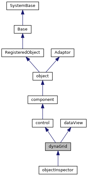
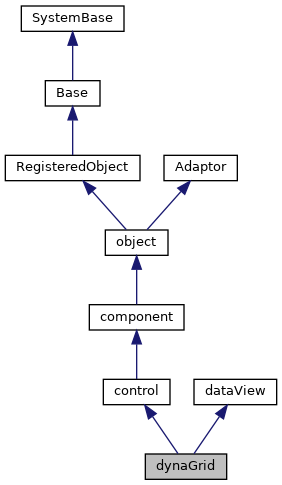
An editable grid control.
The data and size of the grid is provided by the <class>ZEN.Auxiliary.dataSet</class> associated with the grid.
The first dimension of the dataSet supplies rows, the second supplies columns. The third dimension, if present, supplies "pages" for the grid. (One page is visible at a time).
|
private |
Applies the row and column labels defined by the.
<property>rows</property> and <property>columns</property> collections.
|
private |
This callback provides a way to fill in.
the dataSet object used to provide values for this grid.
|
private |
If implemented, this callback method is called at page render-time.
when this component is added to a page.
Reimplemented from object.
| _.Library.Status OnNew | ( | _.Library.RawString | initvalue | ) |
Constructor for Zen objects.
If subclasses override OnNew, they should make sure to invoke this using #super.
Reimplemented from object.
|
private |
This method fills in reasonable default values for.
this control. Used by tools (such as Control Tester) to dynamically create controls.
Reimplemented from control.
| editCell | ( | defval, | |
| which | |||
| ) |
Display edit control in the current cell.
If defval is defined, then use it as the initial value in the editor. which indicates what type of cell is being edited: "row" (row label), "column" (column label), otherwise a data cell.
| getCellContents | ( | data, | |
| r, | |||
| c | |||
| ) |
Prepares data for display within a given cell.
If there is an <method>ondrawcell</method> callback, it is invoked. This callback has a chance to chance the contents that will be displayed within the cell.
Reimplemented in objectInspector.
| getCellInfo | ( | page, | |
| row, | |||
| col | |||
| ) |
Return the cell descriptor for the given cell (if any).
(0-based).
| getCellProperty | ( | pageno, | |
| rowno, | |||
| colno, | |||
| property | |||
| ) |
Get the value of a property for a cell descriptor of this grid.
pageno, rowno, and colno are 1-based.
| getColumnInfo | ( | c | ) |
Return an object containing display information for column c
(0-based).
Reimplemented in objectInspector.
| getEdgeWidth | ( | node, | |
| margins, | |||
| borders, | |||
| padding | |||
| ) |
Calculate the pixels needed to render the edge of a given cell, including.
(potentially) the space needed for the margins, borders and padding
| getEditCellHTML | ( | r, | |
| c, | |||
| value, | |||
| which | |||
| ) |
Return the HTML that renders the cell editor for the given cell.
r and c are 1-based. If r is 0, then we are editing a column header; If c is 0, then we are editing a row header; which indicates what is being edited (see editCell).
| getRowInfo | ( | r | ) |
Return an object containing display information for row r
(0-based).
Reimplemented in objectInspector.
| getSelectedRange | ( | ) |
Return the range of selected cells or null if nothing selected.
The range is returned as an array of startRow,startCol,endRow,endCol.
| moveToCell | ( | dir | ) |
Move to a new, editable, cell.
dir is "up","down","left","right"
Returns true if move was successful.
| notifyViewHandler | ( | reason, | |
| data1, | |||
| data2, | |||
| data3 | |||
| ) |
Notification that the dataController associated with this dataView.
has raised an event.
| selectCell | ( | r, | |
| c, | |||
| notify | |||
| ) |
Make the specified cell the current cell.
r and c are 1-based.
If notify is true, then raise an onSelectCell event.
| selectCellRange | ( | startRow, | |
| startCol, | |||
| endRow, | |||
| endCol | |||
| ) |
Set the selected cell range.
Addresses are 1-based.
| setCellProperty | ( | pageno, | |
| rowno, | |||
| colno, | |||
| property, | |||
| value | |||
| ) |
Set the value of a property for a cell descriptor of this grid.
pageno, rowno, and colno are 1-based.
| setLabelValue | ( | value, | |
| which, | |||
| index | |||
| ) |
Set the value of grid label; index is 1-based.
which is "row" or "column".
| stopEditCell | ( | cancel | ) |
Stop editing of the current cell.
If cancel is true, then do not save current control value.
| OnCreateDataSet |
Name of Server-side callback method to call to information.
for each node of this tree.
This must be the name of a server-only method in the page class that contains this component.
| borders |
Specify whether cell borders should be "all" (the default) or "none".
| cells |
Additional specification for cells within the grid.
This allows cell-by-cell overrides of formats and styles.
| columnHeaderStyle |
Additional style to apply to column headers in this grid.
| columnWidth |
This is the default width (in pixels) used for columns that do not supply a width.
| columns |
Additional specification for columns within the grid.
| currColumn |
This is the column number (1-based) of the current selected cell.
| currPage |
In case of 3-dimensional dataSet, this is the current.
"page" (third dimension) being displayed. (1-based).
| currRow |
This is the row number (1-based) of the current selected cell.
| dataSet |
Data displayed by this grid control.
| editLabels |
If true, the user can double-click on row and column labels and edit their value.
| format |
Default format to apply to cells in this grid.
This is a DeepSee format string: e.g., "###.##" This is overridden by row and column-level formatting.
| gridClass |
Optional CSS class for the table containing the grid.
| gridLabel |
Caption to display in upper, left label cell.
| multiSelect |
If true, users can select a range of cells in the grid.
| nowrap |
If true (the default), then the contents of cells within the grid will not.
word wrap (by setting the nowrap attribute for the cell's td element).
| onarrowclick |
onarrowclick event handler:
If defined, this event is fired when the user clicks on a row or column arrow. The variable which will indicate which arrow is clicked.
| onchangecell |
onchangecell event handler:
If defined, this event is fired when the user changes the value of a cell.
| onchangepage |
onchangepage event handler:
If defined, this event is fired when the user clicks on the next or previous page buttons for a 3D grid. If this callback returns false, the page change will not happen.
| onclickcolumn |
onclickcolumn event handler:
If defined, this event is fired when the user clicks on a column label.
| onclicklabel |
onclicklabel event handler:
If defined, this event is fired when the user clicks on grid label cell in the upper left.
| onclickrow |
onclickrow event handler:
If defined, this event is fired when the user clicks on a row label.
| ondblclick |
ondblclick event handler:
This event is fired when the mouse is double-clicked on the control.
| ondrawcell |
ondrawcell event handler:
If defined, this event is fired when a cell is about to be drawn. If this event handler returns a value, then it is used as DHTML to render the cell contents.
| oneditcell |
oneditcell event handler:
If defined, this event is fired when a cell is about to be edited. If this event handler returns a value, then it is used as DHTML to render the cell editor.
| oneditkeydown |
onkeydown event handler for default cell edit control.
| oneditkeyup |
onkeyup event handler for default cell edit control.
| ongetcellvalue |
ongetcellvalue event handler:
If defined, this event is fired to get the value to display in the current cell.
The current cell row and column number is updated before this call is made.
The event handler is passed 3 variables, row and col, which contain the row and column number of the current cell (1-based); and data, which is the value for the cell provided by the grid's data set.
If not defined or if this event return handler returns null, then the value from the grid's data set is used.
This callback is also invoked when the value of a cell is directly set by the <method>setCellValue</method> method.
This is different than the <property>ondrawcell</property> event, which returns the actual HTML to display within a cell.
| onrender |
onrender event handler:
If defined, this event is fired just before the grid is rendered.
| onselectcell |
onselectcell event handler:
If defined, this event is fired when the user navigates to a new cell.
The current cell row and column number is updated before this call is made.
The event handler is passed 2 variables, row and col, which contain the row and column number of the current cell (1-based).
| rowHeaderStyle |
Additional style to apply to row headers in this grid.
| rowLabelWidth |
Width used for row labels.
This may be specified as either a fixed width in pixels
or as a percentage of the total space allocated for the component.
| rows |
Additional specification for rows within the grid.
| scrollIntoView |
If true, use the zenScrollIntoView function to try and make the.
current cell visible.
| selectedCellBackground |
Background color applied to the selected cell.
| selectedCellColor |
Color applied to the selected cell range.
| selectedRange |
This specifies the current selected range of cells as a.
comma-separated list of integers. The list is of the form:
startRow,startCol,endRow,endCol
All cells numbers are 1-based.
If the range is equal to "", then no cells are selected.
This is only used if <property>multiSelect</property> is true.
| selectedRangeBackground |
Background color applied to the selected cell range.
| showArrows |
Specifies whether the add rows and columns arrows should be displayed.
| showColumnLabels |
Specifies whether column labels should be displayed.
| showRowLabels |
Specifies whether row labels should be displayed.
| showZebra |
Specify whether zebra striping should be applied to the grid.
| style |
Additional style to apply to cells in this grid.
This is applied before any row and column-level styles.
 1.9.1
1.9.1