|
IRISLIB database
|


|
|
IRISLIB database
|
|
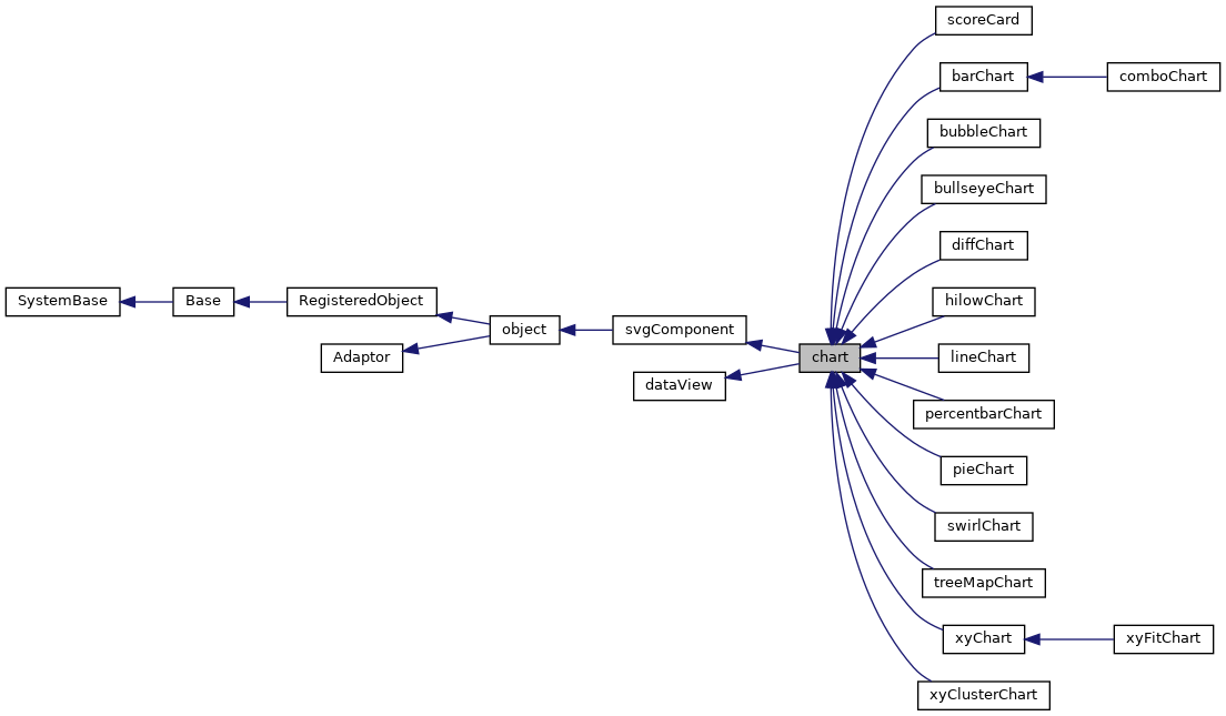
This is the abstract base class from which all SVG chart components are derived. More...
Public Member Functions | |
| adjustChartTitle () | |
| Adjust position of chart title and legend (if needed). | |
| calculateAxisConstraints () | |
| If the plot has axes, pre-calculate the internal values that will be used. More... | |
| calculateYAxisWidth (which) | |
| Internl method to calculate how much room should be reserved. More... | |
| chartElementClickHandler (evt, series, item) | |
| Mouse click handler for chart elements. More... | |
| computeStyle (className, idName) | |
| Compute and return the effective style that governs the rendering. More... | |
| computeXAxisTimeLine () | |
| Compute scaling information for a time-based x-axis. | |
| createMarker (series, item, x, y, color, type, noevents) | |
| Create a plot marker. More... | |
| createSVGTextNode (caption, fontSize, autoScale, align, rotate, parentNode, txtClass, txtStyle) | |
| Create a text node. | |
| embedStyle (element, styleNVP) | |
| Embed the various settings of a computed style name-value object. More... | |
| formatNumeric (nStr) | |
| Format numeric value. | |
| getChartElement (series, item) | |
| Return the svg object for a specified data element (if any). | |
| getChartElementStyle (series, item) | |
| Return default style for the specified data element (if any). More... | |
| getChartRelatedElements (series, item) | |
| Return an array of related svg objects for a specified data element (if any). More... | |
| getChartSubtitle () | |
| Get subtitle for the chart. | |
| getChartTitle () | |
| Get title for the chart. | |
| getColorSchemeArray (scheme) | |
| Return an array of color values for given data series color scheme. | |
| getComputedFontSize (styleNVP, defaultMedium, defaultSmall, defaultLarge) | |
| Given a resolved style name-value pairing object, return the specified font. More... | |
| getCurrYAxis (which) | |
| Get the current y Axis definition used for this chart. More... | |
| getEndTime () | |
| Get the end time for a time-based chart. | |
| getLegendLabels () | |
| Return an array of labels to display within the Legend box. More... | |
| getMarkerShape (series) | |
| Return the marker type that should be used for the given series. | |
| getNumericAbbreviation (val, min, max) | |
| Return a numeric abbreviation for a value. More... | |
| getPelToPixelHRatio () | |
| The Normalized viewbox ranges from 0 0 to 100 100, the physical space. More... | |
| getPelToPixelVRatio () | |
| The Normalized viewbox ranges from 0 0 to 100 100, the physical space. More... | |
| getPlotX (val) | |
| Given a logical value, return the corresponding x-axis. More... | |
| getPlotY (val, yAxisNo) | |
| Given a logical value, return the corresponding y-axis. More... | |
| getRangeGroupForSeries (series) | |
| Indicate which "group" should be used for computing axis ranges. More... | |
| getSelectedItem () | |
| Returns index number (0-based) of the. More... | |
| getSelectedSeries () | |
| Returns index number (0-based) of the data series of the. More... | |
| getSelectedStyle (series, item, isMarker) | |
| Return any additional select/unselect style to apply to a chart element. | |
| getSeriesColor (series) | |
| Return the CSS color that should be used for the given series. | |
| getSeriesCount () | |
| Return the number of data series for this chart. | |
| getSeriesData (series) | |
| Return data values for the given series (0-based) More... | |
| getSeriesNames () | |
| Return an array containing the names of the data series for this chart. More... | |
| getSeriesSVGGroup () | |
| Return the svg group element that contains the data series elements. | |
| getSeriesSize () | |
| Return the number of items within each data series. More... | |
| getSeriesType (series) | |
| Return the type (how a series should be displayed) for the given data series (0-based). More... | |
| getStartTime () | |
| Get the start time for a time-based chart. | |
| getTimeX (time) | |
| For a given time value, YYYY-MM-DD, find the corresponding x coordinate in virtual pixels. | |
| getXAxis () | |
| Return the x Axis definition for this chart. | |
| getXAxisTitle () | |
| Return the x axis title. | |
| getXAxisType () | |
| Return the type of x axis (category or value) used by. More... | |
| getXLabelText (val, base, noformat) | |
| Given a logical value, return the text to use for an axis label. More... | |
| getYAxis (index) | |
| Return the y Axis definition for this chart. More... | |
| getYAxisCount () | |
| Return the number of y Axis definitions for this chart. | |
| getYAxisIndexForSeries (series) | |
| Return the index (0-based) of the y-axis associated with the given data series. More... | |
| getYAxisTitle (which) | |
| Return the y axis title. | |
| getYAxisType () | |
| Return the type of y axis (category or value) used by. More... | |
| getYLabelText (val, yAxisNo, base) | |
| Given a logical value, return the text to use for an axis label. More... | |
| hasAxes () | |
| Indicates that this chart has axes and associated grids. More... | |
| hasMultiples () | |
| Indicates that this chart supports and is in "show multiples" mode. More... | |
| hasSelectedItem () | |
| Returns if there is a current selected element. | |
| integrateStyleSpec (styleNVP, newRule) | |
| Integrate a new Style specification into an existing set of. More... | |
| is3D () | |
| Indicates whether this chart should be drawn with a 3-D. More... | |
| isTimeBased () | |
| Test if a time-based x axis should be used. More... | |
| notifyViewHandler (reason, data1, data2, data3) | |
| Notification that the dataController associated with this dataView. More... | |
| parseStyleSVG (style) | |
| Utility method. More... | |
| pickVerticalSkips (flag, max) | |
| This is the core of the vertical decimation algorithm. More... | |
| plotLineForSeries (group, s, data, stacked, chartFilled, markersVisible, hasEvents) | |
| Draw a line for one data series, s (0-based). More... | |
| prepareAxisGroup (idName, parentNode) | |
| Prepare the axis group for population with axis information. | |
| removeNoDataMsg (plotAreaGroup) | |
| Remove the NoDataMsg from the plot area. | |
| renderAxes () | |
| Draw the x and y axes and grid lines. | |
| renderBands () | |
| Draw the upper/lower bands for the chart. | |
| renderContents () | |
| Client-side method to render control. | |
| renderLegend () | |
| Draw the legend for the chart. | |
| renderPlotArea () | |
| Draw the plot area of the chart. | |
| renderSeries (group) | |
| Draw data series for this chart. More... | |
| renderSeriesGroup () | |
| Draw the data series for this chart. More... | |
| renderTimeEvents (group) | |
| Render a set of time-events within the chart. | |
| renderTitle () | |
| Draw the title for the chart. More... | |
| renderXAxisTimeLine (timeCellGroup, y) | |
| Render x-axis labels and tick marks for time-based x-axis. | |
| renderXAxisTitle (group) | |
| Draw the title section for the Y axis (if any) and. More... | |
| renderXLabels () | |
| Draw the labels for the x axis. | |
| renderYAxisTitle (group, which, xpos) | |
| Draw the title section for the Y axis (if any) and. More... | |
| renderYLabels (which) | |
| Draw the labels for the y axis. | |
| selectElement (series, item) | |
| Select the specified chart element. | |
| setCurrYAxis (axisNo) | |
| Set the current y Axis definition used for this chart. More... | |
| setProperty (property, value1, value2) | |
| Set the value of a named property. | |
| setSizeHandler () | |
| Notification that this component has been resized. | |
| setTimeRange (startTime, endTime, final) | |
| Set the timeline start and end dates and update the chart. More... | |
| setXAxis (axis) | |
| Set the x Axis definition for this chart. More... | |
| setYAxis (axis) | |
| Set the y Axis definition for this chart. More... | |
| showNoDataMsg (msg, plotAreaGroup, clipGroup) | |
| Display the NoDataMsg. More... | |
| updateChart () | |
| Call this method to update contents of this chart. | |
| updateIndicator () | |
| Update the "indicator" (crosshairs) for the selected item. | |
| usePercentForRange () | |
| This method returns true if data series is a "percentage bar chart" and so. More... | |
| useSumForRange () | |
| This method returns true if data series should be summed. More... | |
| xToLogical (val) | |
| Convert a user-provided x-coordinate into 0-100 logical space. More... | |
| yToLogical (val) | |
| Convert a user-provided y-coordinate into 0-100 logical space. More... | |
 Public Member Functions inherited from svgComponent Public Member Functions inherited from svgComponent | |
| beginWaitState () | |
| Begin a wait state for this component. More... | |
| calculateViewBox () | |
| Calculate the value of the viewBox attribute of this. More... | |
| clickHandler (evt) | |
| Default mouse click handler. | |
| endWaitState () | |
| End the current wait state for this component. | |
| findSVGElement (subid) | |
| Client-side utility method that finds an SVG element with a. More... | |
| getFrame () | |
| Return the svgFrame object this component belongs to. | |
| getSizeAbsolute () | |
| Return an object containing (as x,y,width, and height properties) More... | |
| refreshContents () | |
| This is not supported for SVG components. | |
| renderSVG (document, parent) | |
| Render the outer SVG enclosing group for this component. More... | |
| setOverlayMode (mode) | |
| Display an overlay for this component to trap mouse events. More... | |
| setPosition (x, y) | |
| Set the x,y position of this component. More... | |
| setPositionHandler () | |
| Notification that this component has been moved. More... | |
| setSize (w, h) | |
| Set the size (width and height) of this component. More... | |
| setTextNode (id, str) | |
| Utility method: More... | |
| sizingMouseDownHandler (evt, which) | |
| Internal: sizing handle mouse down handler. | |
| unrender () | |
| Remove the inner SVG for this component. | |
| wrapMethod (methodName) | |
| Utility method: More... | |
| Public Member Functions inherited from object | |
| _.Library.Status | OnNew (_.Library.RawString initvalue) |
| Constructor for Zen objects. More... | |
| findElement (subid) | |
| Client-side utility method that finds an HTML element with a. More... | |
| fireOnUpdateEvent () | |
| This is called when an object is updated from the server. More... | |
| _.Library.String | getProperty (property, key) |
| Return the value of a named property (i.e. More... | |
| getSettings (settings) | |
| Client-side method that returns a list of this component's. More... | |
| getType () | |
| Returns the component type of this object. More... | |
| invokeSuper (method, args) | |
| Invoke the superclass method method of the current. More... | |
| isOfType (type) | |
| Returns true if this object is of the given component type. More... | |
| makeId (subid) | |
| client-side utility method that constructs a component-specific id More... | |
| onCreate () | |
| This client method, if present, is called when this component is. More... | |
| onDelete () | |
| This client method, if present, is called when this component is. More... | |
| onSerialize () | |
| This client event, if present, is fired before a component. More... | |
| onloadHandler () | |
| This client event, if present, is fired when the page is loaded. | |
| onunloadHandler () | |
| This client event, if present, is fired when the page is unloaded. More... | |
| onupdateHandler () | |
| This client method, if present, is fired when the object is updated from the server. | |
| render () | |
| This causes a component that draws its contents dynamically. More... | |
| Public Member Functions inherited from RegisteredObject | |
| _.Library.Status | OnAddToSaveSet (_.Library.Integer depth, _.Library.Integer insert, _.Library.Integer callcount) |
| This callback method is invoked when the current object is added to the SaveSet,. More... | |
| _.Library.Status | OnClose () |
| This callback method is invoked by the <METHOD>Close</METHOD> method to. More... | |
| _.Library.Status | OnConstructClone (_.Library.RegisteredObject object, _.Library.Boolean deep, _.Library.String cloned) |
| This callback method is invoked by the <METHOD>ConstructClone</METHOD> method to. More... | |
| _.Library.Status | OnNew () |
| This callback method is invoked by the <METHOD>New</METHOD> method to. More... | |
| _.Library.Status | OnValidateObject () |
| This callback method is invoked by the <METHOD>ValidateObject</METHOD> method to. More... | |
| Public Member Functions inherited from Adaptor | |
| _.Library.Status | XMLExport (_.Library.String top, _.Library.String format, _.XML.Namespaces namespaces, attrs, _.Library.String createId, _.Library.String typeAttr, oreflist, idlist, _.Library.String initialIndent, _.Library.Boolean local, _.Net.MIMEPart mimeAttachments) |
| Serialize an XML enabled class as an XML document and write. More... | |
| _.Library.Status | XMLExportToStream (_.Stream.Object export, _.Library.String top, _.Library.String format, _.XML.Namespaces namespaces, attrs, _.Library.String createId, _.Library.String typeAttr, oreflist, idlist, _.Library.String initialIndent) |
| Serialize an XML enabled class as an XML document and appends it to a stream. More... | |
| _.Library.Status | XMLExportToString (_.Library.String export, _.Library.String top, _.Library.String format, _.XML.Namespaces namespaces, attrs, _.Library.String createId, _.Library.String typeAttr, oreflist, idlist, _.Library.String initialIndent) |
| Serialize an XML enabled class as an XML document and write it to a string. More... | |
| Public Member Functions inherited from dataView | |
| _.Library.Status | AcquireDataFromController () |
| Server-side method used by dataView implementation classes to. More... | |
| getController () | |
| Get the dataController component associated with this dataView, if present. More... | |
| sendEventToController (reason, data1, data2, data3) | |
| If connected, send an event to a dataController. More... | |
| setControllerId (id) | |
| Set the controller id for this dataView and establish a connection. More... | |
Public Attributes | |
| appearance | |
| Controls the appearance of this chart. More... | |
| autoScaleText | |
| Specifies how the text elements of a chart should be handled when a chart is. More... | |
| axisLineStyle | |
| Optional: style applied to line drawn for x and y axes. More... | |
| axisTitleStyle | |
| Optional: default style applied to axis titles for this chart. More... | |
| backgroundStyle | |
| Optional: style used for chart background panel. More... | |
| bandLower | |
| If defined, then a colored band (specified by <property>bandLowerStyle</property>) More... | |
| bandLowerStyle | |
| Optional: style used for upper band on plot area. More... | |
| bandUpper | |
| If defined, then a colored band (specified by <property>bandUpperStyle</property>) More... | |
| bandUpperStyle | |
| Optional: style used for upper band on plot area. More... | |
| baseLineStyle | |
| Optional: style applied to base line. More... | |
| borderOffset | |
| Optional: distance (in pixels) between the background rectangle and the border. More... | |
| borderRadius | |
| Optional: radius applied to the chart's background rectangle and border. More... | |
| borderStyle | |
| Optional: style used for border line inset from outer edge of chart. More... | |
| currYAxis | |
| Specifies which yAxis definition is used to drive the chart yaxis (0 based). More... | |
| endTime | |
| Latest displayed time (as YYYY-MM-DD HH:MM:SS). More... | |
| gridStyle | |
| Optional: default style applied to all grid line elements for this chart. More... | |
| hasZoom | |
| Optional: if true, display zoom in/out buttons (for certain chart types). More... | |
| indicatorStyle | |
| Optional: style used for indicators. More... | |
| indicatorsVisible | |
| Specifies whether indicator lines should be displayed for the selected item. More... | |
| labelStyle | |
| Optional: default style applied to all grid label elements for this chart. More... | |
| labelsVisible | |
| If true, display axis labels for this chart (or slice labels in the. More... | |
| legendHeight | |
| If this chart has a legend, height (within the chart coordinate space) of legend box. More... | |
| legendLabelStyle | |
| Optional: style used for text within the legend box. More... | |
| legendRectStyle | |
| Optional: style used for rectangle indicating the current legend within the legend box. More... | |
| legendStyle | |
| Optional: style used for background of the legend box. More... | |
| legendTitle | |
| Title to display for legend box. More... | |
| legendVisible | |
| If true, display a legend for this chart. More... | |
| legendWidth | |
| If this chart has a legend, width (within the chart coordinate space) of legend box. More... | |
| legendX | |
| If this chart has a legend, x-position (within the chart coordinate space) of legend box. More... | |
| legendY | |
| If this chart has a legend, y-position (within the chart coordinate space) of legend box. More... | |
| lineStyle | |
| Optional: default style applied to svg line elements within line-style charts. More... | |
| marginBottom | |
| Margin (within the chart coordinate space) from bottom edge of chart to bottom edge of grid (plot area). More... | |
| marginLeft | |
| Margin (within the chart coordinate space) from left edge of chart to left edge of grid (plot area). More... | |
| marginRight | |
| Margin (within the chart coordinate space) from right edge of chart to right edge of grid (plot area). More... | |
| marginTop | |
| Margin (within the chart coordinate space) from top edge of chart to top edge of grid (plot area). More... | |
| markerScale | |
| Scaling applied to chart markers: More... | |
| markerShapes | |
| Comma-delimited list of marker shapes used for data series markers. More... | |
| markerStyle | |
| Optional: style used for series markers. More... | |
| markersVisible | |
| Specifies whether markers should be displayed for the data. More... | |
| maxLabelLen | |
| Maximum number of characters to display for an axis label. More... | |
| msgIfNoData | |
| localized warning message if chart has no data More... | |
| multipleTitleStyle | |
| Optional: style used for title text within each "multiple" charts. More... | |
| noDataFill | |
| color of background rectangle for no data message More... | |
| noDataOpacity | |
| opacity of background rectangle for no data message More... | |
| noDataStroke | |
| color of no data message More... | |
| onelementClick | |
| onelementClick event handler: More... | |
| ongetData | |
| ongetData event handler: More... | |
| ongetLabelX | |
| ongetLabelX event handler: More... | |
| ongetLabelY | |
| ongetLabelY event handler: More... | |
| ongetSeriesColor | |
| ongetSeriesColor event handler: More... | |
| ongetTimeEvents | |
| ongetTimeEvents event handler: More... | |
| onrenderData | |
| onrenderData event handler: More... | |
| onrenderPlotArea | |
| onrenderPlotArea event handler: More... | |
| onshowTooltip | |
| onshowTooltip event handler: More... | |
| plotAreaStyle | |
| Optional: style used for chart plot area panel. More... | |
| plotEdgeStyle | |
| Optional: for charts with a 3D look, this style is applied. More... | |
| plotStyle | |
| Optional: default style applied to svg elements used for plotting. More... | |
| plotToEdge | |
| Specifies how values should be plotted along a category axis. More... | |
| scrollButtonStyle | |
| Optional: style applied to zoom and scroll buttons when visible. More... | |
| selectedItem | |
| Item number (0-based) of currently selected chart element, if any. More... | |
| selectedItemStyle | |
| Optional: style used to indicate the current selected chart element. More... | |
| selectedSeries | |
| Series number (0-based) of currently selected chart element, if any. More... | |
| seriesColorScheme | |
| This is the name of a built-in color scheme used to plot. More... | |
| seriesColors | |
| Comma-delimited list of CSS color values used for data series. More... | |
| seriesColorsOverride | |
| Additional Comma-delimited list of CSS color values used for data series. More... | |
| seriesCount | |
| Number of data series to display on this chart. More... | |
| seriesNames | |
| Comma-delimited list of names used to label each data series in the legend box. More... | |
| seriesNumber | |
| Optional. More... | |
| seriesSize | |
| Number of items within each data series to display on this chart. More... | |
| seriesYAxes | |
| Optional. More... | |
| showMultiples | |
| Optional: If true, display chart as number of small multiple charts, one per data series. More... | |
| startTime | |
| Earliest displayed time (as YYYY-MM-DD HH:MM:SS). More... | |
| stripeStyle | |
| Optional: style used for grid stripes (when enabled). More... | |
| stripesVisible | |
| Optional: if true, draw stripes over value axis grid lines. More... | |
| subtitle | |
| Subtitle to display for chart. More... | |
| subtitleStyle | |
| Optional: style used for subtitle text. More... | |
| textSize | |
| Optional: if "medium", use the default font sizes specified by the CSS for the chart. More... | |
| timeBased | |
| Optional: If true, then the x-axis for this chart is a time line displaying date values. More... | |
| title | |
| Title to display for chart. More... | |
| titleAlign | |
| Optional: alignment for title and subtitle. More... | |
| titleBoxStyle | |
| Optional: style used for box underneath title text. More... | |
| titleImage | |
| Optional: URL of image to display within the title area. More... | |
| titleImageStyle | |
| Optional. More... | |
| titleStyle | |
| Optional: style used for title text. More... | |
| titleX | |
| If this chart has a title, x-position (within the chart coordinate space) of the title. More... | |
| titleY | |
| If this chart has a title, y-position (within the chart coordinate space) of the title. More... | |
| tooltipRectStyle | |
| if non-null used to set style for tool tip rectangle More... | |
| unselectedItemStyle | |
| Optional: style used to indicate unselected chart elements. More... | |
| valueBoxStyle | |
| Optional: style used for boxes around value labels. More... | |
| valueLabelFormat | |
| Optional: numeric format applied to value labels. More... | |
| valueLabelStyle | |
| Optional: style used for value labels. More... | |
| valueLabelsVisible | |
| Specifies whether values should be displayed for elements within the chart. More... | |
| warnIfNoData | |
| Set to 1 to display a localized warning message if chart has no data. More... | |
| xAxis | |
| x axis specification for this chart. More... | |
| yAxis | |
| Deprecated. More... | |
| yAxisList | |
| List of y axis specifications for this chart. More... | |
| Public Attributes inherited from svgComponent | |
| boundless | |
| If true, this component is boundless. More... | |
| document | |
| Client-side property that points to SVG document this component is rendered on. More... | |
| height | |
| Width of this component. More... | |
| hidden | |
| If true, this component is hidden. More... | |
| onclick | |
| onclick event handler: More... | |
| position | |
| If position is "fixed", then this shape will not scroll with its canvas. More... | |
| preserveAspectRatio | |
| Value to apply for this component's enclosing svg element's. More... | |
| svgComponent | |
| Client-side property used to determine if a component is an SVG component. More... | |
| svgGroup | |
| Client-side property that points to the enclosing SVG group element for this component. More... | |
| viewBoxHeight | |
| If defined, this is used to calculate the height of the. More... | |
| viewBoxWidth | |
| If defined, this is used to calculate the width of the. More... | |
| width | |
| Width of this component. More... | |
| x | |
| x position of this component's enclosing group. More... | |
| y | |
| y position of this component's enclosing group. More... | |
| Public Attributes inherited from object | |
| aux | |
| @qualifier final This is an auxiliary property that is provided More... | |
| composite | |
| @qualifier final For components that are created as part of a composite component, More... | |
| id | |
| @qualifier final This is a unique identifier that is used to distinguish this object More... | |
| index | |
| @qualifier final System-assigned index number used internally to identify this component. More... | |
| name | |
| @qualifier final Name of this object. More... | |
| onupdate | |
| onupdate event handler: More... | |
| parent | |
| @qualifier final Link to the component that contains this object More... | |
| tuple | |
| @qualifier final Special property indicating which tuple of a More... | |
| visible | |
| This property indicates whether a component is visible and thus layed out. More... | |
| window | |
| @qualifier final This is a client-only property that refers to the JavaScript More... | |
| Public Attributes inherited from dataView | |
| controller | |
| Internal property. More... | |
| controllerId | |
| Optional. More... | |
| onnotifyView | |
| onnotifyView event handler: More... | |
Static Public Attributes | |
| DEFAULTAPPEARANCE = None | |
| Default appearance of this component. | |
| DEFAULTASPECT = None | |
| Do not worry about preserving the aspect ratio. | |
| DEFAULTAUTOSCALETEXT = None | |
| Default setting for autoscaling text as chart resizes. | |
| DEFAULTMARKERSVISIBLE = None | |
| Default value for the markersVisible property. | |
| DEFAULTPLOTTOEDGE = None | |
| Parameter SYSMODULE = "chart";. More... | |
| DEFAULTVALUELABELSVISIBLE = None | |
| Default value for the valueLabelsVisible property. | |
| DEFAULTVIEWBOXHEIGHT = None | |
| Default viewBoxHeight of this component. More... | |
| DEFAULTVIEWBOXWIDTH = None | |
| Default viewBoxWidth of this component. More... | |
| Static Public Attributes inherited from svgComponent | |
| DEFAULTASPECT = None | |
| Subclasses can set this to change the default value for the <property>preserveAspectRatio/<property> property for a component. | |
| DEFAULTBOUNDLESS = None | |
| Subclasses can set this to change the default value for the <property>boundless</property> property for a component. | |
| DEFAULTHEIGHT = None | |
| Default height of this component. | |
| DEFAULTHIDDEN = None | |
| Subclasses can set this to change the default value for the <property>hidden</property> property for a component. | |
| DEFAULTVIEWBOXHEIGHT = None | |
| Default viewBoxHeight of this component. | |
| DEFAULTVIEWBOXWIDTH = None | |
| Default viewBoxWidth of this component. | |
| DEFAULTVISIBLE = None | |
| Subclasses can set this to change default visibilty for a component. | |
| DEFAULTWIDTH = None | |
| Default width of this component. | |
| POSTCOMPILEACTIONS = None | |
| Internal parameter. | |
| Static Public Attributes inherited from object | |
| DEFAULTVISIBLE = None | |
| Subclasses can set this to change default visibilty for a component. | |
| INCLUDEFILES = None | |
| CSV list of additional include files (either .js or .css) that. More... | |
| MODULE = None | |
| If set, this indicates that this system component should be. More... | |
| NAMESPACE = None | |
| This is the XML namespace used for library components. | |
| POSTCOMPILEACTIONS = None | |
| This is a comma-delimited list of which post-compile actions this component. More... | |
| USECOMMONDIRECTORY = None | |
| If true, then the include files generated for this component, are placed in the. More... | |
| XMLFORMAT = None | |
| If XMLFORMAT="Literal", then only support for literal format import and export is generated. More... | |
| XMLIGNOREINVALIDATTRIBUTE = None | |
| By setting this to 0, we disallow use of invalid attribute names in Zen XML documents. | |
| Static Public Attributes inherited from RegisteredObject | |
| CAPTION = None | |
| Optional name used by the Form Wizard for a class when generating forms. More... | |
| JAVATYPE = None | |
| The Java type to be used when exported. | |
| PROPERTYVALIDATION = None | |
| This parameter controls the default validation behavior for the object. More... | |
| Static Public Attributes inherited from Adaptor | |
| ATTRIBUTEQUALIFIED = None | |
| ATTRIBUTEQUALIFIED controls the format of exported XML by controlling whether attributes. More... | |
| ELEMENTQUALIFIED = None | |
| ELEMENTQUALIFIED controls the format of exported XML. More... | |
| NAMESPACE = None | |
| NAMESPACE specifies the XML namespace to be used when projecting the. More... | |
| SUPPRESSTYPEPREFIX = None | |
| SUPPRESSTYPEPREFIX allows the type name that refers to this class. More... | |
| XMLDEFAULTREFERENCE = None | |
| XMLDEFAULTREFERENCE specifies the default value of the XMLREFERENCE property parameter. More... | |
| XMLENABLED = None | |
| If this parameter is true then XML-enabling methods. More... | |
| XMLFORMAT = None | |
| The XMLFORMAT parameter controls the generation of the XMLExport and XMLImport. More... | |
| XMLIGNOREINVALIDATTRIBUTE = None | |
| The XMLIGNOREINVALIDATTRIBUTE parameter allows the programmer to control handling of unexpected. More... | |
| XMLIGNOREINVALIDTAG = None | |
| The XMLIGNOREINVALIDTAG parameter allows the programmer to control handling of unexpected. More... | |
| XMLIGNORENULL = None | |
| XMLIGNORENULL allows the programmer to override the default XML handling. More... | |
| XMLINCLUDEINGROUP = None | |
| XMLINCLUDEINGROUP allows the programmer to control whether a class is included. More... | |
| XMLINHERITANCE = None | |
| If the XMLINHERITANCE parameter is set to "LEFT", then in the case of multiple. More... | |
| XMLNAME = None | |
| This parameter provides the default XMLNAME for the class. More... | |
| XMLNIL = None | |
| The XMLNIL class parameter controls the use of xsi:nil by XMLExport. More... | |
| XMLNILNOOBJECT = None | |
| The XMLNILNOOBJECT parameter allows creation of an object to be skipped for elements. More... | |
| XMLPREFIX = None | |
| The XMLPREFIX parameter controls the prefix to be used for the XML namespace that. More... | |
| XMLSEQUENCE = None | |
| If the XMLSEQUENCE = 1, then the order of the XML elements must match the. More... | |
| XMLSUMMARY = None | |
| The summary fields to be used when an object is referenced are specified. More... | |
| XMLTYPE = None | |
| This parameter provides the default XMLTYPE for the class. More... | |
| XMLUNSWIZZLE = None | |
| If the XMLUNSWIZZLE parameter is set to 1, then single object. More... | |
| XMLUSEEMPTYELEMENT = None | |
| If the XMLUSEEMPTYELEMENT parameter is set to 1, then the empty element shorthand (<tag>) More... | |
Additional Inherited Members | |
| Static Public Member Functions inherited from Adaptor | |
| _.Library.Status | XMLDTD (_.Library.String top, _.Library.String format, _.Library.Boolean input, dtdlist) |
| Write the DTD to the current device for this XML enabled class serialized as. More... | |
| _.Library.RegisteredObject | XMLNew (_.XML.Document document, _.Library.Integer node, _.Library.RegisteredObject containerOref) |
| Get an instance of an XML enabled class. More... | |
| _.Library.Status | XMLSchema (_.Library.String top, _.Library.String format, _.Library.String namespacePrefix, _.Library.Boolean input, _.Library.Boolean refOnly, schema) |
| Write an XML Schema fragment to the current device which describes an XML enabled class and dependent classes. More... | |
| _.Library.String | XMLSchemaNamespace () |
| Get the namespace to which this class belongs for use in schema generation. More... | |
| _.Library.Status | XMLSchemaType (_.XML.Schema schemaInstance, _.XML.Node node, _.Library.String top, _.Library.Boolean encoded, _.Library.Boolean summary, _.Library.Boolean input, _.Library.Boolean refOnly) |
| Add a complexType to the schema that is respresented by an <class>XML.Schema</class> instance. More... | |
This is the abstract base class from which all SVG chart components are derived.
A chart provides a base on which to display a specific type of chart (such as a <class>barChart</class>, <class>lineChart</class>, or <class>pieChart</class>).
This base class defines the data, grid (axes and scales), styles, and legend used by charts.
All charts are plotted onto a virtual coordinate space that measures 100 units by 100 units.
You can adjust the visual aspects of a chart by setting the various properties of this class (plus any additional properties added by the specific chart subclass).
You can adjust the x and y axis settings (such as scaling and range) via the <property>xAxis</property> and <property>yAxis</property> properties (which are objects of the type <class>ZEN.Auxiliary.axis</class>).
| calculateAxisConstraints | ( | ) |
If the plot has axes, pre-calculate the internal values that will be used.
to govern how those axes are rendered
| calculateYAxisWidth | ( | which | ) |
Internl method to calculate how much room should be reserved.
for the Y axis area. This includes both the axis title and the individual labels
| chartElementClickHandler | ( | evt, | |
| series, | |||
| item | |||
| ) |
Mouse click handler for chart elements.
Subclasses can use this method to associated click events with chart elements.
| computeStyle | ( | className, | |
| idName | |||
| ) |
Compute and return the effective style that governs the rendering.
of a given SVG element based on class and Id
| createMarker | ( | series, | |
| item, | |||
| x, | |||
| y, | |||
| color, | |||
| type, | |||
| noevents | |||
| ) |
Create a plot marker.
This may be used by subclasses to display markers. type can be 'up','down','circle','square'.
| embedStyle | ( | element, | |
| styleNVP | |||
| ) |
Embed the various settings of a computed style name-value object.
as direct attributes of the given node.
| getChartElementStyle | ( | series, | |
| item | |||
| ) |
Return default style for the specified data element (if any).
This is used to restore styles when chart elements are unselected. Subclasses can override this.
Reimplemented in treeMapChart, swirlChart, pieChart, percentbarChart, lineChart, hilowChart, bullseyeChart, and barChart.
| getChartRelatedElements | ( | series, | |
| item | |||
| ) |
Return an array of related svg objects for a specified data element (if any).
(such as the edges of a 3d rendering).
Reimplemented in pieChart, and bullseyeChart.
| getComputedFontSize | ( | styleNVP, | |
| defaultMedium, | |||
| defaultSmall, | |||
| defaultLarge | |||
| ) |
Given a resolved style name-value pairing object, return the specified font.
size, if none has been specified, return one of three default values based on the value of the textSize property.
| getCurrYAxis | ( | which | ) |
Get the current y Axis definition used for this chart.
which is "left" or "right".
| getLegendLabels | ( | ) |
Return an array of labels to display within the Legend box.
Default implementation is to return a list of series names.
Reimplemented in xyClusterChart, xyChart, treeMapChart, swirlChart, pieChart, hilowChart, and bubbleChart.
| getNumericAbbreviation | ( | val, | |
| min, | |||
| max | |||
| ) |
Return a numeric abbreviation for a value.
min and max are range that value falls within. E.g., 10K for 10000
| getPelToPixelHRatio | ( | ) |
The Normalized viewbox ranges from 0 0 to 100 100, the physical space.
occupied by the chart is specified as the width and height (in pixels) of the base SVG group. This function returns a mapping of logical picture units to pixels in the horizontal direction.
| getPelToPixelVRatio | ( | ) |
The Normalized viewbox ranges from 0 0 to 100 100, the physical space.
occupied by the chart is specified as the width and height (in pixels) of the base SVG group. This function returns a mapping of logical picture units to pixels in the vertical direction.
| getPlotX | ( | val | ) |
Given a logical value, return the corresponding x-axis.
coordinate.
| getPlotY | ( | val, | |
| yAxisNo | |||
| ) |
Given a logical value, return the corresponding y-axis.
coordinate.
| getRangeGroupForSeries | ( | series | ) |
Indicate which "group" should be used for computing axis ranges.
This is overridden by combo charts.
Reimplemented in comboChart.
| getSelectedItem | ( | ) |
Returns index number (0-based) of the.
current selected item, or -1 if there is no current selection.
| getSelectedSeries | ( | ) |
Returns index number (0-based) of the data series of the.
current selected item, or -1 if there is no current selection.
| getSeriesData | ( | series | ) |
Return data values for the given series (0-based)
from the chart's data cache.
| getSeriesNames | ( | ) |
Return an array containing the names of the data series for this chart.
If a name is missing, the series number is used.
If the chart is connected to a data controller, get the names from the controller.
Reimplemented in bubbleChart.
| getSeriesSize | ( | ) |
Return the number of items within each data series.
(this assumes that all data series have the same number of items).
| getSeriesType | ( | series | ) |
Return the type (how a series should be displayed) for the given data series (0-based).
This is used by combo chart and ignored by all others.
Reimplemented in percentbarChart, comboChart, and barChart.
| getXAxisType | ( | ) |
Return the type of x axis (category or value) used by.
this chart.
Reimplemented in xyClusterChart, xyChart, percentbarChart, lineChart, hilowChart, bubbleChart, and barChart.
| getXLabelText | ( | val, | |
| base, | |||
| noformat | |||
| ) |
Given a logical value, return the text to use for an axis label.
Subclasses can override this for custom behavior. JSL4133 - pass an optional base we can add to val when label is null
| getYAxis | ( | index | ) |
Return the y Axis definition for this chart.
(or null if not found).
| getYAxisIndexForSeries | ( | series | ) |
Return the index (0-based) of the y-axis associated with the given data series.
It may return -1 if the chart is not rendered yet.
| getYAxisType | ( | ) |
Return the type of y axis (category or value) used by.
this chart.
Reimplemented in xyClusterChart, xyChart, percentbarChart, lineChart, hilowChart, bubbleChart, and barChart.
| getYLabelText | ( | val, | |
| yAxisNo, | |||
| base | |||
| ) |
Given a logical value, return the text to use for an axis label.
base is an arbitrary delta but can be used to make labels 0-based or 1-based default is 0-based for backwards compatibility Can be overriden by user through sub-classing
Reimplemented in swirlChart.
| hasAxes | ( | ) |
Indicates that this chart has axes and associated grids.
A subclass may override this to turn off axis display.
Reimplemented in treeMapChart, swirlChart, pieChart, bullseyeChart, and scoreCard.
| hasMultiples | ( | ) |
Indicates that this chart supports and is in "show multiples" mode.
A subclass may override this.
Reimplemented in treeMapChart, swirlChart, pieChart, lineChart, bullseyeChart, and barChart.
| integrateStyleSpec | ( | styleNVP, | |
| newRule | |||
| ) |
Integrate a new Style specification into an existing set of.
name-value style pairs, adding and overwriting existing styles as appropriate
| is3D | ( | ) |
Indicates whether this chart should be drawn with a 3-D.
appearance.
Reimplemented in treeMapChart, swirlChart, pieChart, and bullseyeChart.
| isTimeBased | ( | ) |
Test if a time-based x axis should be used.
This is overridden in subclasses.
Reimplemented in lineChart, and comboChart.
| notifyViewHandler | ( | reason, | |
| data1, | |||
| data2, | |||
| data3 | |||
| ) |
Notification that the dataController associated with this dataView.
has raised an event.
| parseStyleSVG | ( | style | ) |
Utility method.
Split an SVG css value into individual style values.
Return an object containing these values.
| pickVerticalSkips | ( | flag, | |
| max | |||
| ) |
This is the core of the vertical decimation algorithm.
Given a maximum number of label
to choose from an array, pick a subset that will (hopefully) use the available space effectively and keep things visually balanced.
| plotLineForSeries | ( | group, | |
| s, | |||
| data, | |||
| stacked, | |||
| chartFilled, | |||
| markersVisible, | |||
| hasEvents | |||
| ) |
Draw a line for one data series, s (0-based).
data contains the data for all series as an array of arrays.
| renderSeries | ( | group | ) |
Draw data series for this chart.
This is implemented by subclasses. group is the SVG container for the chart components.
Reimplemented in xyFitChart, xyClusterChart, xyChart, treeMapChart, swirlChart, pieChart, percentbarChart, lineChart, hilowChart, diffChart, bullseyeChart, bubbleChart, and barChart.
| renderSeriesGroup | ( | ) |
Draw the data series for this chart.
This method renders the container for the data series and then invokes a sub-class specific <method>renderSeries</method> method.
| renderTitle | ( | ) |
Draw the title for the chart.
Return the height of the title.
| renderXAxisTitle | ( | group | ) |
Draw the title section for the Y axis (if any) and.
return the height reserved for the rendering
| renderYAxisTitle | ( | group, | |
| which, | |||
| xpos | |||
| ) |
Draw the title section for the Y axis (if any) and.
return the width reserved for the rendering
| setCurrYAxis | ( | axisNo | ) |
Set the current y Axis definition used for this chart.
axisNo is the index of the y-axis, 0-based.
| setTimeRange | ( | startTime, | |
| endTime, | |||
| final | |||
| ) |
Set the timeline start and end dates and update the chart.
If endTime is not provided, update it to preserve the current time range using startTime as a new starting time.
Time values are in 'yyyy-mm-dd' format. This prevents the repaint that would happen if start and end dates are set separately.
| setXAxis | ( | axis | ) |
Set the x Axis definition for this chart.
Return the old axis if present.
| setYAxis | ( | axis | ) |
Set the y Axis definition for this chart.
Return the old axis if present.
| showNoDataMsg | ( | msg, | |
| plotAreaGroup, | |||
| clipGroup | |||
| ) |
Display the NoDataMsg.
If the plotAreaGroup and clipGroup objects are known in the calling context,
they may be passed in, otherwise the method will attempt to find them.
| usePercentForRange | ( | ) |
This method returns true if data series is a "percentage bar chart" and so.
calculated data range should be 0 to 100%
Reimplemented in percentbarChart.
| useSumForRange | ( | ) |
This method returns true if data series should be summed.
when calculating data range for the chart. Typically a chart will return true if it is in "stacked" mode.
Reimplemented in percentbarChart, lineChart, hilowChart, diffChart, and barChart.
| xToLogical | ( | val | ) |
Convert a user-provided x-coordinate into 0-100 logical space.
This means: 10 returns 10, but "10px" is converted using the current width of the chart.
| yToLogical | ( | val | ) |
Convert a user-provided y-coordinate into 0-100 logical space.
This means: 10 returns 10, but "10px" is converted using the current height of the chart.
|
static |
Parameter SYSMODULE = "chart";.
Default value for the plotToEdge property.
|
static |
Default viewBoxHeight of this component.
This is set to 100 to provide a fixed coordinate system for meters.
|
static |
Default viewBoxWidth of this component.
This is set to 100 to provide a fixed coordinate system for meters.
| appearance |
Controls the appearance of this chart.
Set this to "2D" (the default) for a standard chart appearance.
Setting this to "3D" will give the chart a 3-D appearance; the plot area will appear to be recessed. Certain chart types, such as bar charts, will display items with a 3-D look.
For pie charts, setting this to "3D" will display a pie chart with a 3-D appearance, but will not affect the plot area.
| autoScaleText |
Specifies how the text elements of a chart should be handled when a chart is.
resized. If True, the text scales in proportion to the chart itself and all requested labels are rendered regardless of legibility. If false, the size of the text elements is fixed with respect to the page and some lables may be omitted to avoid visual overlap if insufficient space is provided to render the values should the chart be scaled down beyond certain thresholds
| axisLineStyle |
Optional: style applied to line drawn for x and y axes.
| axisTitleStyle |
Optional: default style applied to axis titles for this chart.
This is applied in addition to the style supplied by <property>labelStyle</property>.
| backgroundStyle |
Optional: style used for chart background panel.
| bandLower |
If defined, then a colored band (specified by <property>bandLowerStyle</property>)
is displayed on the plot area covering the range lower than this value;
| bandLowerStyle |
Optional: style used for upper band on plot area.
| bandUpper |
If defined, then a colored band (specified by <property>bandUpperStyle</property>)
is displayed on the plot area covering the range greater than this value;
| bandUpperStyle |
Optional: style used for upper band on plot area.
| baseLineStyle |
Optional: style applied to base line.
| borderOffset |
Optional: distance (in pixels) between the background rectangle and the border.
| borderRadius |
Optional: radius applied to the chart's background rectangle and border.
| borderStyle |
Optional: style used for border line inset from outer edge of chart.
| currYAxis |
Specifies which yAxis definition is used to drive the chart yaxis (0 based).
| endTime |
Latest displayed time (as YYYY-MM-DD HH:MM:SS).
This is used for the x axis in a timeBased chart.
| gridStyle |
Optional: default style applied to all grid line elements for this chart.
If defined, this style overrides any styles define in the CSS style definition for the page, but is in turn overridden by any styles defined by a specific axis element.
| hasZoom |
Optional: if true, display zoom in/out buttons (for certain chart types).
| indicatorStyle |
Optional: style used for indicators.
| indicatorsVisible |
Specifies whether indicator lines should be displayed for the selected item.
within the chart.
This only applies to charts that display indicator lines.
| labelStyle |
Optional: default style applied to all grid label elements for this chart.
If defined, this style overrides any styles define in the CSS style definition for the page, but is in turn overridden by any styles defined by a specific axis element.
| labelsVisible |
If true, display axis labels for this chart (or slice labels in the.
case of a pie chart).
| legendHeight |
If this chart has a legend, height (within the chart coordinate space) of legend box.
If not specified a default height (based on number of data series) will be used.
| legendLabelStyle |
Optional: style used for text within the legend box.
| legendRectStyle |
Optional: style used for rectangle indicating the current legend within the legend box.
| legendStyle |
Optional: style used for background of the legend box.
| legendTitle |
Title to display for legend box.
| legendVisible |
If true, display a legend for this chart.
If "auto" then the legend is displayed if there is more than one data series for the chart.
| legendWidth |
If this chart has a legend, width (within the chart coordinate space) of legend box.
If not specified a default width will be used.
| legendX |
If this chart has a legend, x-position (within the chart coordinate space) of legend box.
If not specified a default position will be used.
| legendY |
If this chart has a legend, y-position (within the chart coordinate space) of legend box.
If not specified a default position will be used.
| lineStyle |
Optional: default style applied to svg line elements within line-style charts.
| marginBottom |
Margin (within the chart coordinate space) from bottom edge of chart to bottom edge of grid (plot area).
If not specified, then this value will be automatically calculated.
| marginLeft |
Margin (within the chart coordinate space) from left edge of chart to left edge of grid (plot area).
If not specified, then this width will be automatically calculated.
| marginRight |
Margin (within the chart coordinate space) from right edge of chart to right edge of grid (plot area).
If not specified, then this width will be automatically calculated.
| marginTop |
Margin (within the chart coordinate space) from top edge of chart to top edge of grid (plot area).
If not specified, then this value will be automatically calculated.
| markerScale |
Scaling applied to chart markers:
A value of 1.0 (or '') will display markers with their default size. This only applies to charts that support markers.
| markerShapes |
Comma-delimited list of marker shapes used for data series markers.
Possible values are 'up','down','square','circle'.
This only applies to charts that support markers.
| markerStyle |
Optional: style used for series markers.
| markersVisible |
Specifies whether markers should be displayed for the data.
points within the chart.
This only applies to charts that display markers.
| maxLabelLen |
Maximum number of characters to display for an axis label.
| msgIfNoData |
localized warning message if chart has no data
| multipleTitleStyle |
Optional: style used for title text within each "multiple" charts.
Used when <property>showMultiples</property> is enabled.
| noDataFill |
color of background rectangle for no data message
| noDataOpacity |
opacity of background rectangle for no data message
| noDataStroke |
color of no data message
| onelementClick |
onelementClick event handler:
This event handler is called by the chart when the user clicks the mouse on a chart element (such as a line chart marker, or bar in a bar chart).
The event handler is passed an argument, chart, that is this chart object. You can then use the <method>getSelectedItem</method> method to determine the current selected element.
| ongetData |
ongetData event handler:
This event handler, if defined, is called by the chart to get an array of values to plot for a data series. This provides an alternate way to provide display data for a chart.
The event handler is passed an argument, series, that contains the ordinal number (0-based) of the data series. This event handler should return an array of numeric values for the specified data series.
| ongetLabelX |
ongetLabelX event handler:
This event handler, if defined, is called by the chart to get the text for a given label on the x axis.
The event handler is passed an argument, value, that contains the ordinal number (0-based) of the label.
| ongetLabelY |
ongetLabelY event handler:
This event handler, if defined, is called by the chart to get the text for a given label on the y axis.
The event handler is passed an argument, value, that contains the ordinal number (0-based) of the label.
| ongetSeriesColor |
ongetSeriesColor event handler:
This event handler, if defined, is called by the chart to get the color for a given data series.
The event handler is passed an argument, series, that contains the ordinal number (0-based) of the series.
| ongetTimeEvents |
ongetTimeEvents event handler:
This event handler, if defined, is called by the chart to get an array of "time events" to display for a time chart.
| onrenderData |
onrenderData event handler:
This event handler, if defined, is called by the chart just after it is finished displaying grid lines and data. The event handler is passed an argument, chart, that is this chart object. If it also passed group, which is the SVG group to which any new svg content should be added.
| onrenderPlotArea |
onrenderPlotArea event handler:
This event handler, if defined, is called by the chart just after it displays its underlying plot area (and bands) but before it display grid lines and data.
| onshowTooltip |
onshowTooltip event handler:
This event handler, if defined, is called by the chart just before it displays a tool tip.
| plotAreaStyle |
Optional: style used for chart plot area panel.
| plotEdgeStyle |
Optional: for charts with a 3D look, this style is applied.
to the edges on the left and bottom.
| plotStyle |
Optional: default style applied to svg elements used for plotting.
data by this chart (such as the bars within a bar chart). Note: lines within line charts use the <property>lineStyle</property> property.
| plotToEdge |
Specifies how values should be plotted along a category axis.
If true, plot the first and last values on the edges of the plotArea (as in a line chart). If false, plot values in the centers of each unit (as in a bar chart).
This is specified by subclasses.
| scrollButtonStyle |
Optional: style applied to zoom and scroll buttons when visible.
| selectedItem |
Item number (0-based) of currently selected chart element, if any.
| selectedItemStyle |
Optional: style used to indicate the current selected chart element.
| selectedSeries |
Series number (0-based) of currently selected chart element, if any.
| seriesColorScheme |
This is the name of a built-in color scheme used to plot.
data series for the chart.
If <property>seriesColors</property> is defined, then this property is ignored.
| seriesColors |
Comma-delimited list of CSS color values used for data series.
This can be set to a list of SVG fill color values, e.g., "red,green,blue" or "url(#glow-red),url(#glow-green),url(#glow-blue)".
The first color is used by the first data series and so on. If there are more data series than colors, the colors are repeated.
If this is not defined the colors defined by <property>seriesColorScheme</property> are used.
| seriesColorsOverride |
Additional Comma-delimited list of CSS color values used for data series.
If supplied, this is merged with the colors in the seriesColors list. This makes it possible to override specific colors within a chart while preserving the underlying default colors.
| seriesCount |
Number of data series to display on this chart.
If "", then this is computed automatically from the chart's data source when the chart is connected to a dataController.
| seriesNames |
Comma-delimited list of names used to label each data series in the legend box.
This is a localized value (the entire list is treated as one localized string).
| seriesNumber |
Optional.
If defined then the chart will only plot the specified data series (0-based) when connected
to a data controller. This is used by DeepSee in some cases.
| seriesSize |
Number of items within each data series to display on this chart.
If "", then this is computed automatically from the chart's data source when the chart is connected to a dataController.
| seriesYAxes |
Optional.
If defined, specifies which y-axis should be used for each data
series. This is a csv-list of y-axis numbers (0-based). By default, the every data series uses y-axis 0.
| showMultiples |
Optional: If true, display chart as number of small multiple charts, one per data series.
This is only used by charts that support small multiples otherwise it is ignored.
| startTime |
Earliest displayed time (as YYYY-MM-DD HH:MM:SS).
This is used for the x axis in a timeBased chart.
| stripeStyle |
Optional: style used for grid stripes (when enabled).
| stripesVisible |
Optional: if true, draw stripes over value axis grid lines.
| subtitle |
Subtitle to display for chart.
| subtitleStyle |
Optional: style used for subtitle text.
| textSize |
Optional: if "medium", use the default font sizes specified by the CSS for the chart.
if "small" or "large" adjust the size of any text in the chart that does not have an explicit style set (via a property).
| timeBased |
Optional: If true, then the x-axis for this chart is a time line displaying date values.
from <property>startTime</property> to <property>endTime</property>. In this case, the series names for data are interpreted as time values (YYYY-MM-DD HH:MM:SS). This setting only works in a few cases, namely non-pivotted line charts. For all other cases this setting is ignored.
| title |
Title to display for chart.
| titleAlign |
Optional: alignment for title and subtitle.
| titleBoxStyle |
Optional: style used for box underneath title text.
| titleImage |
Optional: URL of image to display within the title area.
| titleImageStyle |
Optional.
Style for titleImage: left,top,width, and height.
| titleStyle |
Optional: style used for title text.
| titleX |
If this chart has a title, x-position (within the chart coordinate space) of the title.
If not specified, then a default value is calculated.
| titleY |
If this chart has a title, y-position (within the chart coordinate space) of the title.
If not specified, then a default value is calculated.
| tooltipRectStyle |
if non-null used to set style for tool tip rectangle
| unselectedItemStyle |
Optional: style used to indicate unselected chart elements.
This is used when there is a selected element.
| valueBoxStyle |
Optional: style used for boxes around value labels.
This only applies to charts that display element values (such as bar charts).
| valueLabelFormat |
Optional: numeric format applied to value labels.
This only applies to charts that display element values (such as bar charts).
| valueLabelStyle |
Optional: style used for value labels.
This only applies to charts that display element values (such as bar charts).
| valueLabelsVisible |
Specifies whether values should be displayed for elements within the chart.
This only applies to charts that display element values (such as bar charts).
| warnIfNoData |
Set to 1 to display a localized warning message if chart has no data.
| xAxis |
x axis specification for this chart.
| yAxis |
Deprecated.
y axis specifications for this chart.
This is replaced by yAxisList. This property is kept here so that applications that set yAxis directly will still function.
| yAxisList |
List of y axis specifications for this chart.
 1.9.1
1.9.1