|
IRISLIB database
|


|
|
IRISLIB database
|
|
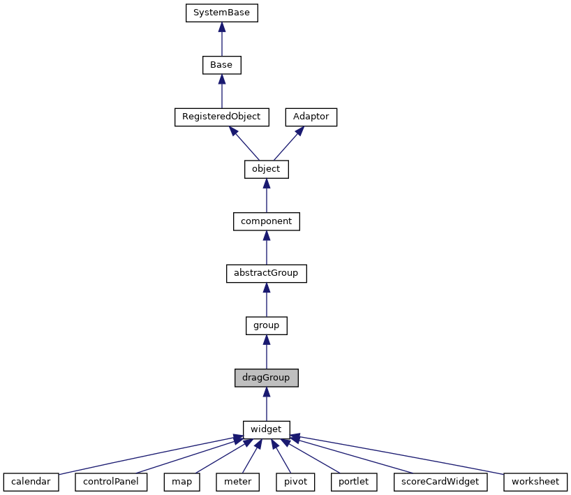
A specialized type of group that can be placed within a desktop group. More...
Public Member Functions | |
| abortClose () | |
| Public utility to abort the a window closure in progress. | |
| adjustChildArea () | |
| Utility to adjust the size of the dragChildren area in the. More... | |
| adjustHandleWidth () | |
| Utility to adjust the width of the drag header to correctly position. More... | |
| adjustResizeBox () | |
| Utility to adjust the location of the resize box to correctly position. More... | |
| close (event) | |
| Callback to close the subwindow. | |
| compress (event) | |
| Callback to reduce subwindow to the height of its title bar. | |
| constrainDragX (engine, wrapper, intendedX) | |
| Callback to limit horizontal resizing. | |
| constrainDragY (engine, wrapper, intendedY) | |
| Callback to limit vertical resizing. | |
| disableDrag () | |
| Disable user drag events for this group. | |
| disableHeaderMaxToggle () | |
| Reset the maximize toggle mode set up by enableHeaderMaxToggle. | |
| disableResize () | |
| Disable user resize events for this group. | |
| enableDrag () | |
| Enable user drag events for this group. | |
| enableHeaderMaxToggle () | |
| When rendering static windows, enable a click anywhere on the. More... | |
| enableResize () | |
| Enable user resize events for this group. | |
| endDrag (engine, wrapper) | |
| Callback to wrap up window resize event. | |
| expand (event) | |
| Callback to restore a compressed pane to it miniture display mode. | |
| getChildDiv () | |
| Return the HTML div element that wraps the children of this group. | |
| getCoverplateDiv () | |
| Return the HTML div element needed as a cover plate for event management under. More... | |
| getHeaderDiv () | |
| Return the HTML div element that wraps the header of this group. | |
| getHeaderUserDiv () | |
| Return the HTML div element reserver for user content in the header of this group. | |
| getState () | |
| Return a string that captures the current state of the group's layout. | |
| getWindowHeight () | |
| Return the internal height of the drag window in pixles. | |
| getWindowWidth () | |
| Return the internal width of the drag window in pixles. | |
| isCompressed () | |
| Returns true if the drag window is currently rendered in. More... | |
| isMaximized () | |
| Returns true if the drag window is currently rendered in. More... | |
| isResizeInProgress () | |
| Checks to see if the user is actively in the process of resizing the. More... | |
| maximize (event) | |
| Callback to switch subwindow into full screen mode. | |
| normalize (event) | |
| Callback to switch a full screen window back down to it previous. More... | |
| onGrabHandler () | |
| Launches a callback (if defined) when the drag group is grabbed by. More... | |
| onRefreshContents () | |
| Client-side method to ensure that the controller has an accurate model. More... | |
| onReleaseHandler () | |
| Launches a callback (if defined) when the drag group's title bar is released. More... | |
| processAppMessage (value) | |
| Generic method to receive client "broadcast" messages. More... | |
| removeWindowChrome () | |
| Remove the header entirely and disable resize. | |
| renderContents () | |
| Client-side method to render control. | |
| renderHeader () | |
| Render the contents of the header section of this component. | |
| renderResize () | |
| Add resize box for this component. | |
| resetWindowChrome () | |
| Restore header and resize controls previously remove by removeWindowChrome. | |
| resize (width, height) | |
| Resize the active group to the given geometry. | |
| restoreGeometry () | |
| Restore key layout information about group in after a radical presentation change. | |
| restoreState (str) | |
| Given a previously encoded layout string, restore a group to its. More... | |
| saveGeometry () | |
| Save key layout information about group in anticipation of a radical presentation change. | |
| setBodyStyle (value) | |
| Set the CSS styles of the header section of the element. More... | |
| setHeaderStyle (value) | |
| Set the CSS styles of the header section of the element. More... | |
| setProperty (property, value, value2) | |
| Set the value of a named property. | |
| startDrag (engine, wrapper) | |
| Callback to initiate window resize event. | |
| syncObject () | |
| If the object has been moved or resized inside a snapGrid, sync the server-side. More... | |
 Public Member Functions inherited from group Public Member Functions inherited from group | |
| LayoutChildren (_.Library.Integer pTuple) | |
| Does the actual work of laying out the children of this group. More... | |
| Public Member Functions inherited from abstractGroup | |
| addChild (component, refresh) | |
| Client-side method. More... | |
| addChildAfter (component, sibling, refresh) | |
| Client-side method. More... | |
| addChildBefore (component, sibling, refresh) | |
| Client-side method. More... | |
| childrenMutated () | |
| Notification to subclasses that a child has been added or removed. More... | |
| exposeComponent () | |
| This manages the ondisplay event callback handling. More... | |
| getChildIndex (child) | |
| Look for the given child object within this group's set of. More... | |
| ondisabledHandler () | |
| Client-side method that is called when a group's disabled. More... | |
| onloadHandler () | |
| This client event, if present, is fired when the page is loaded. | |
| removeChild (component) | |
| Client-side method. More... | |
| setOverlayMode (mode) | |
| Set overlay mode for each child of this group. | |
| setPropertyAll (property, value, value2) | |
| Apply the given value to the specified property for. More... | |
| Public Member Functions inherited from component | |
| dragFinishHandler (dragData) | |
| This is called when a drag operation started within this component. More... | |
| dragHandler () | |
| This is called by the layout manager when a drag-and-drop operation. More... | |
| dragNotifyHandler (dragData) | |
| This is called by the layout manager when a drag operation. More... | |
| dragStartHandler (dragData) | |
| This is called when a drag operation is started within this component. More... | |
| dropHandler () | |
| This is called by the layout manager when a drag-and-drop operation. More... | |
| dropStartHandler (dragData) | |
| This is called when a data drop operation is started within this component. More... | |
| getEnclosingDiv () | |
| Client-side method returns the div element that encloses. More... | |
| _.Library.String | getHidden () |
| Return whether this component is hidden. | |
| getHintElement () | |
| Client-side method returns the HTML element that displays. More... | |
| getLabelElement () | |
| Client-side method returns the HTML element that displays. More... | |
| onDisplayHandler () | |
| This client callback is called from exposeComponent after. More... | |
| onEndModalHandler (zindex) | |
| Notification that this component is about to stop being modal. | |
| onPopupAction (popupName, action, value) | |
| This client event, if present, is fired when a popup page has specified. More... | |
| onStartModalHandler (zindex) | |
| Notification that this component is about to become modal. More... | |
| refreshContents (sync) | |
| This method, called from a client page, invokes this component's. More... | |
| setHidden (flag) | |
| If flag is true, hide this component. More... | |
| startProgressBar (div) | |
| Start the display of a progress bar within display. More... | |
| stopProgressBar () | |
| Stop the timer used by the Progress bar. | |
| Public Member Functions inherited from object | |
| _.Library.Status | OnNew (_.Library.RawString initvalue) |
| Constructor for Zen objects. More... | |
| findElement (subid) | |
| Client-side utility method that finds an HTML element with a. More... | |
| fireOnUpdateEvent () | |
| This is called when an object is updated from the server. More... | |
| _.Library.String | getProperty (property, key) |
| Return the value of a named property (i.e. More... | |
| getSettings (settings) | |
| Client-side method that returns a list of this component's. More... | |
| getType () | |
| Returns the component type of this object. More... | |
| invokeSuper (method, args) | |
| Invoke the superclass method method of the current. More... | |
| isOfType (type) | |
| Returns true if this object is of the given component type. More... | |
| makeId (subid) | |
| client-side utility method that constructs a component-specific id More... | |
| onCreate () | |
| This client method, if present, is called when this component is. More... | |
| onDelete () | |
| This client method, if present, is called when this component is. More... | |
| onSerialize () | |
| This client event, if present, is fired before a component. More... | |
| onunloadHandler () | |
| This client event, if present, is fired when the page is unloaded. More... | |
| onupdateHandler () | |
| This client method, if present, is fired when the object is updated from the server. | |
| render () | |
| This causes a component that draws its contents dynamically. More... | |
| renderSVG (document, parent) | |
| This method is only needed for SVG components. More... | |
| Public Member Functions inherited from RegisteredObject | |
| _.Library.Status | OnAddToSaveSet (_.Library.Integer depth, _.Library.Integer insert, _.Library.Integer callcount) |
| This callback method is invoked when the current object is added to the SaveSet,. More... | |
| _.Library.Status | OnClose () |
| This callback method is invoked by the <METHOD>Close</METHOD> method to. More... | |
| _.Library.Status | OnConstructClone (_.Library.RegisteredObject object, _.Library.Boolean deep, _.Library.String cloned) |
| This callback method is invoked by the <METHOD>ConstructClone</METHOD> method to. More... | |
| _.Library.Status | OnNew () |
| This callback method is invoked by the <METHOD>New</METHOD> method to. More... | |
| _.Library.Status | OnValidateObject () |
| This callback method is invoked by the <METHOD>ValidateObject</METHOD> method to. More... | |
| Public Member Functions inherited from Adaptor | |
| _.Library.Status | XMLExport (_.Library.String top, _.Library.String format, _.XML.Namespaces namespaces, attrs, _.Library.String createId, _.Library.String typeAttr, oreflist, idlist, _.Library.String initialIndent, _.Library.Boolean local, _.Net.MIMEPart mimeAttachments) |
| Serialize an XML enabled class as an XML document and write. More... | |
| _.Library.Status | XMLExportToStream (_.Stream.Object export, _.Library.String top, _.Library.String format, _.XML.Namespaces namespaces, attrs, _.Library.String createId, _.Library.String typeAttr, oreflist, idlist, _.Library.String initialIndent) |
| Serialize an XML enabled class as an XML document and appends it to a stream. More... | |
| _.Library.Status | XMLExportToString (_.Library.String export, _.Library.String top, _.Library.String format, _.XML.Namespaces namespaces, attrs, _.Library.String createId, _.Library.String typeAttr, oreflist, idlist, _.Library.String initialIndent) |
| Serialize an XML enabled class as an XML document and write it to a string. More... | |
Public Attributes | |
| centerHeader | |
| If set, this boolean flag indicates that the title section of the header. More... | |
| colSpan | |
| If used as a child of a snapGroup, this specifies the (initial static) width of the widget. More... | |
| header | |
| Title to display in header section for this group. More... | |
| headerLayout | |
| The header layout pattern determines the order in which control windows are added. More... | |
| homeCol | |
| If used as a child of a snapGroup, this specifies the (initial static) row hosting the. More... | |
| homeRow | |
| If used as a child of a snapGroup, this specifies the (initial static) row hosting the. More... | |
| imageAppLogo | |
| URI of image to display for the close group button. More... | |
| imageAppLogoWidth | |
| Width (in pixels) of image to display for the close group button. More... | |
| imageClose | |
| URI of image to display for the close group button. More... | |
| imageCloseHover | |
| URI of image to display for the close group button when mouse is present. More... | |
| imageCloseWidth | |
| Width (in pixels) of image to display for the close group button. More... | |
| imageContract | |
| URI of image to display for the contract group button. More... | |
| imageContractHover | |
| URI of image to display for the contract group button when mouse is present. More... | |
| imageContractWidth | |
| Width (in pixels) of image to display for the contract group button. More... | |
| imageExpand | |
| URI of image to display for the expand group button. More... | |
| imageExpandHover | |
| URI of image to display for the expand group button when mouse is present. More... | |
| imageExpandWidth | |
| Width (in pixels) of image to display for the expand group button. More... | |
| imageMaximize | |
| URI of image to display for the maximize group button. More... | |
| imageMaximizeHover | |
| URI of image to display for the maximize group button when mouse is present. More... | |
| imageMaximizeWidth | |
| Width (in pixels) of image to display for the maximize group button. More... | |
| imageMinimize | |
| URI of image to display for the minimize group button. More... | |
| imageMinimizeHover | |
| URI of image to display for the minimize group button when mouse is present. More... | |
| imageMinimizeWidth | |
| Width (in pixels) of image to display for the minimize group button. More... | |
| imageResize | |
| URI of image to display for the minimize group button. More... | |
| imageResizeSize | |
| Square area in pixels for the resize icon. More... | |
| minWidth | |
| This sets the minimum width (in pixels) for a dragGroup during resizing. More... | |
| moveEnabled | |
| If set, the default, this boolean flag allows the drag group to be repositioned by. More... | |
| onclosepending | |
| onclosepending event handler: More... | |
| onresize | |
| onresize event handler: More... | |
| onwindowdrop | |
| onwindowdrop event handler: More... | |
| onwindowgrab | |
| onwindowgrab event handler: More... | |
| resizeEnabled | |
| If set, the default, this boolean flag allows the drag group to be resized by. More... | |
| rowSpan | |
| If used as a child of a snapGroup, this specifies the (initial static) height of the widget. More... | |
| Public Attributes inherited from group | |
| cellAlign | |
| Specifies horizontal alignment of cells layed out within this group. More... | |
| cellSize | |
| Specifies how the size of cells within this group should be calculated (along layout direction). More... | |
| cellStyle | |
| Specifies additional style for cells layed out within this group. More... | |
| cellVAlign | |
| Specifies vertical alignment of cells layed out within this group. More... | |
| groupClass | |
| Optional CSS class used for table displayed by this group. More... | |
| groupStyle | |
| Optional style used for table displayed by this group. More... | |
| labelPosition | |
| Specifies where labels should be displayed for components within this group. More... | |
| layout | |
| Specifies how components within this group should be layed out. More... | |
| onclick | |
| onclick event handler: More... | |
| Public Attributes inherited from abstractGroup | |
| children | |
| Set of components within this group. More... | |
| disabled | |
| If true, this group and its children are disabled. More... | |
| Public Attributes inherited from component | |
| align | |
| Specifies how this component should be horizontally aligned within its layout cell. More... | |
| containerStyle | |
| CSS style applied to the td element used to contain this child component within. More... | |
| dragEnabled | |
| If this value is true and dragAndDrop is enabled for the page, then. More... | |
| dropEnabled | |
| If this value is true and dragAndDrop is enabled for the page, then. More... | |
| enclosingClass | |
| Optional CSS class used for this component's enclosing div. More... | |
| enclosingStyle | |
| Optional CSS style applied to this component's enclosing div. More... | |
| error | |
| Run-time value; Set to indicate an error within this component. More... | |
| height | |
| Specifies the height of this component with respect to its container. More... | |
| hidden | |
| If true, this component is hidden. More... | |
| hint | |
| User defined hint text used to display additional hint text for this component. More... | |
| hintClass | |
| Optional CSS class used for the component hint. More... | |
| hintStyle | |
| User defined style used for the component hint. More... | |
| label | |
| User defined label used to label this component. More... | |
| labelClass | |
| Optional CSS class used for the component label. More... | |
| labelDisabledClass | |
| Optional CSS class used for the component label when disabled. More... | |
| labelStyle | |
| User defined style used for the component label. More... | |
| onafterdrag | |
| onafterdrag event handler: More... | |
| onbeforedrag | |
| onbeforedrag event handler: More... | |
| ondrag | |
| ondrag event handler: More... | |
| ondrop | |
| ondrop event handler: More... | |
| onhide | |
| onhide event handler: More... | |
| onrefresh | |
| onrefresh event handler: More... | |
| onshow | |
| onshow event handler: More... | |
| showLabel | |
| Controls whether a label is displayed for this component. More... | |
| slice | |
| User-defined number of units of relative space this. More... | |
| title | |
| Help text (tool tip) displayed when mouse hovers over this component (or its label). More... | |
| valign | |
| Specifies how this component should be vertically aligned within its layout cell. More... | |
| width | |
| Specifies the width of this component with respect to its container. More... | |
| Public Attributes inherited from object | |
| aux | |
| @qualifier final This is an auxiliary property that is provided More... | |
| composite | |
| @qualifier final For components that are created as part of a composite component, More... | |
| id | |
| @qualifier final This is a unique identifier that is used to distinguish this object More... | |
| index | |
| @qualifier final System-assigned index number used internally to identify this component. More... | |
| name | |
| @qualifier final Name of this object. More... | |
| onupdate | |
| onupdate event handler: More... | |
| parent | |
| @qualifier final Link to the component that contains this object More... | |
| tuple | |
| @qualifier final Special property indicating which tuple of a More... | |
| visible | |
| This property indicates whether a component is visible and thus layed out. More... | |
| window | |
| @qualifier final This is a client-only property that refers to the JavaScript More... | |
Static Public Attributes | |
| DEFAULTCLOSEIMAGE = None | |
| Default image for close group button. | |
| DEFAULTCONTRACTIMAGE = None | |
| Default image for contract group button. | |
| DEFAULTENCLOSINGCLASS = None | |
| Subclasses can set this to change default css class for a group. | |
| DEFAULTEXPANDIMAGE = None | |
| Default image for expand group button. | |
| DEFAULTHEADERLAYOUT = None | |
| Default header layout pattern. | |
| DEFAULTLAYOUT = None | |
| Subclasses can set this to change default layout for a group. | |
| DEFAULTMAXIMAGE = None | |
| Default image for maximize group button. | |
| DEFAULTMINIMAGE = None | |
| Default image for minimize group button. | |
| DEFAULTRESIZEICONSIZE = None | |
| Default resize icon size in pixels. | |
| DEFAULTRESIZEIMAGE = None | |
| Default image for maximize group button. | |
| Static Public Attributes inherited from group | |
| DEFAULTCELLALIGN = None | |
| Subclasses can set this to change default cellAlign for a group. | |
| DEFAULTCELLSIZE = None | |
| Subclasses can set this to change default cellSize for a group. | |
| DEFAULTCELLSTYLE = None | |
| Subclasses can set this to change default cellStyle for a group. | |
| DEFAULTCELLVALIGN = None | |
| Subclasses can set this to change default cellVAlign for a group. | |
| DEFAULTGROUPCLASS = None | |
| Subclasses can set this to change default css class for a group. | |
| DEFAULTGROUPSTYLE = None | |
| Subclasses can set this to change default groupStyle for a group. | |
| DEFAULTLABELPOSITION = None | |
| Subclasses can set this to change default labelPosition for a group. | |
| DEFAULTLAYOUT = None | |
| Subclasses can set this to change default layout for a group. | |
| Static Public Attributes inherited from abstractGroup | |
| DEFAULTGROUPCLASS = None | |
| Subclasses can set this to change default css class for a group. | |
| Static Public Attributes inherited from component | |
| DEFAULTENCLOSINGCLASS = None | |
| Subclasses can set this to change default enclosingClass used for this. More... | |
| DEFAULTHEIGHT = None | |
| Subclasses can set this to change default height for a component. | |
| DEFAULTHIDDEN = None | |
| Subclasses can set this to change default hidden property for a component. | |
| DEFAULTHINTCLASS = None | |
| Subclasses can set this to change default css class used for hints. | |
| DEFAULTLABELCLASS = None | |
| Subclasses can set this to change default css class used for labels. | |
| DEFAULTLABELDISABLEDCLASS = None | |
| Subclasses can set this to change default css class used for disabled labels. | |
| DEFAULTVISIBLE = None | |
| Subclasses can set this to change default visibilty for a component. | |
| DEFAULTWIDTH = None | |
| Subclasses can set this to change default width for a component. | |
| Static Public Attributes inherited from object | |
| DEFAULTVISIBLE = None | |
| Subclasses can set this to change default visibilty for a component. | |
| INCLUDEFILES = None | |
| CSV list of additional include files (either .js or .css) that. More... | |
| MODULE = None | |
| If set, this indicates that this system component should be. More... | |
| NAMESPACE = None | |
| This is the XML namespace used for library components. | |
| POSTCOMPILEACTIONS = None | |
| This is a comma-delimited list of which post-compile actions this component. More... | |
| USECOMMONDIRECTORY = None | |
| If true, then the include files generated for this component, are placed in the. More... | |
| XMLFORMAT = None | |
| If XMLFORMAT="Literal", then only support for literal format import and export is generated. More... | |
| XMLIGNOREINVALIDATTRIBUTE = None | |
| By setting this to 0, we disallow use of invalid attribute names in Zen XML documents. | |
| Static Public Attributes inherited from RegisteredObject | |
| CAPTION = None | |
| Optional name used by the Form Wizard for a class when generating forms. More... | |
| JAVATYPE = None | |
| The Java type to be used when exported. | |
| PROPERTYVALIDATION = None | |
| This parameter controls the default validation behavior for the object. More... | |
| Static Public Attributes inherited from Adaptor | |
| ATTRIBUTEQUALIFIED = None | |
| ATTRIBUTEQUALIFIED controls the format of exported XML by controlling whether attributes. More... | |
| ELEMENTQUALIFIED = None | |
| ELEMENTQUALIFIED controls the format of exported XML. More... | |
| NAMESPACE = None | |
| NAMESPACE specifies the XML namespace to be used when projecting the. More... | |
| SUPPRESSTYPEPREFIX = None | |
| SUPPRESSTYPEPREFIX allows the type name that refers to this class. More... | |
| XMLDEFAULTREFERENCE = None | |
| XMLDEFAULTREFERENCE specifies the default value of the XMLREFERENCE property parameter. More... | |
| XMLENABLED = None | |
| If this parameter is true then XML-enabling methods. More... | |
| XMLFORMAT = None | |
| The XMLFORMAT parameter controls the generation of the XMLExport and XMLImport. More... | |
| XMLIGNOREINVALIDATTRIBUTE = None | |
| The XMLIGNOREINVALIDATTRIBUTE parameter allows the programmer to control handling of unexpected. More... | |
| XMLIGNOREINVALIDTAG = None | |
| The XMLIGNOREINVALIDTAG parameter allows the programmer to control handling of unexpected. More... | |
| XMLIGNORENULL = None | |
| XMLIGNORENULL allows the programmer to override the default XML handling. More... | |
| XMLINCLUDEINGROUP = None | |
| XMLINCLUDEINGROUP allows the programmer to control whether a class is included. More... | |
| XMLINHERITANCE = None | |
| If the XMLINHERITANCE parameter is set to "LEFT", then in the case of multiple. More... | |
| XMLNAME = None | |
| This parameter provides the default XMLNAME for the class. More... | |
| XMLNIL = None | |
| The XMLNIL class parameter controls the use of xsi:nil by XMLExport. More... | |
| XMLNILNOOBJECT = None | |
| The XMLNILNOOBJECT parameter allows creation of an object to be skipped for elements. More... | |
| XMLPREFIX = None | |
| The XMLPREFIX parameter controls the prefix to be used for the XML namespace that. More... | |
| XMLSEQUENCE = None | |
| If the XMLSEQUENCE = 1, then the order of the XML elements must match the. More... | |
| XMLSUMMARY = None | |
| The summary fields to be used when an object is referenced are specified. More... | |
| XMLTYPE = None | |
| This parameter provides the default XMLTYPE for the class. More... | |
| XMLUNSWIZZLE = None | |
| If the XMLUNSWIZZLE parameter is set to 1, then single object. More... | |
| XMLUSEEMPTYELEMENT = None | |
| If the XMLUSEEMPTYELEMENT parameter is set to 1, then the empty element shorthand (<tag>) More... | |
Private Member Functions | |
| DrawHTML () | |
| Static HTML display method: draw the BODY of this component. More... | |
Additional Inherited Members | |
| Static Public Member Functions inherited from Adaptor | |
| _.Library.Status | XMLDTD (_.Library.String top, _.Library.String format, _.Library.Boolean input, dtdlist) |
| Write the DTD to the current device for this XML enabled class serialized as. More... | |
| _.Library.RegisteredObject | XMLNew (_.XML.Document document, _.Library.Integer node, _.Library.RegisteredObject containerOref) |
| Get an instance of an XML enabled class. More... | |
| _.Library.Status | XMLSchema (_.Library.String top, _.Library.String format, _.Library.String namespacePrefix, _.Library.Boolean input, _.Library.Boolean refOnly, schema) |
| Write an XML Schema fragment to the current device which describes an XML enabled class and dependent classes. More... | |
| _.Library.String | XMLSchemaNamespace () |
| Get the namespace to which this class belongs for use in schema generation. More... | |
| _.Library.Status | XMLSchemaType (_.XML.Schema schemaInstance, _.XML.Node node, _.Library.String top, _.Library.Boolean encoded, _.Library.Boolean summary, _.Library.Boolean input, _.Library.Boolean refOnly) |
| Add a complexType to the schema that is respresented by an <class>XML.Schema</class> instance. More... | |
A specialized type of group that can be placed within a desktop group.
A drag group displays a header (which can include various buttons). The user can drag the group around within its containing desktop group.
|
private |
| adjustChildArea | ( | ) |
Utility to adjust the size of the dragChildren area in the.
event of a resize action
| adjustHandleWidth | ( | ) |
Utility to adjust the width of the drag header to correctly position.
the header controls based on the current drag group width
| adjustResizeBox | ( | ) |
Utility to adjust the location of the resize box to correctly position.
the control based on the current drag group width
| enableHeaderMaxToggle | ( | ) |
When rendering static windows, enable a click anywhere on the.
header handle to toggle full screen mode instead of allowing drag operations
| getCoverplateDiv | ( | ) |
Return the HTML div element needed as a cover plate for event management under.
certain versions of IE
| isCompressed | ( | ) |
Returns true if the drag window is currently rendered in.
header only mode
| isMaximized | ( | ) |
Returns true if the drag window is currently rendered in.
maximized mode
| isResizeInProgress | ( | ) |
Checks to see if the user is actively in the process of resizing the.
window
| normalize | ( | event | ) |
Callback to switch a full screen window back down to it previous.
(iconified or mini-window) mode
| onGrabHandler | ( | ) |
Launches a callback (if defined) when the drag group is grabbed by.
the title bar for the purpose of relocation
| onRefreshContents | ( | ) |
Client-side method to ensure that the controller has an accurate model.
to work with even if the DOM has been modified externally
Reimplemented from abstractGroup.
| onReleaseHandler | ( | ) |
Launches a callback (if defined) when the drag group's title bar is released.
after relocation gesture
| processAppMessage | ( | value | ) |
Generic method to receive client "broadcast" messages.
Subclasses
can override this to extend the broadcast functionality.
Reimplemented in widget.
| restoreState | ( | str | ) |
Given a previously encoded layout string, restore a group to its.
previous state
| setBodyStyle | ( | value | ) |
Set the CSS styles of the header section of the element.
The value passed may take one of three forms: It can be a CSS Snippet in a string "background-color:#0000ff;font-weight:bold;" It can be a JSON string abiding by JavaScript's CSS conventions "{'backgroundColor':'#0000ff', 'fontWeight':'bold' }" Or it can be an actual javascript object {backgroundColor:'#0000ff', fontWeight:'bold'}
| setHeaderStyle | ( | value | ) |
Set the CSS styles of the header section of the element.
The value passed may take one of three forms: It can be a CSS Snippet in a string "background-color:#0000ff;font-weight:bold;" It can be a JSON string abiding by JavaScript's CSS conventions "{'backgroundColor':'#0000ff', 'fontWeight':'bold' }" Or it can be an actual javascript object {backgroundColor:'#0000ff', fontWeight:'bold'}
| syncObject | ( | ) |
If the object has been moved or resized inside a snapGrid, sync the server-side.
visible geometry properties with the actual location and extents
| centerHeader |
If set, this boolean flag indicates that the title section of the header.
should be centered over the dragGroup
| colSpan |
If used as a child of a snapGroup, this specifies the (initial static) width of the widget.
in columns
| header |
Title to display in header section for this group.
| headerLayout |
The header layout pattern determines the order in which control windows are added.
to the header section of the dragGroup window frame. This is encoded as a five character string consisting of the following tokens
'I' represents the Iconify button
'T' represents the Title section with both application logo and header caption
'F' represents the Full screen button
'C' represents the Close button
'U' represents the User content div (if desired)
This string allows one to restructure the location of the controls with a single call and might be useful if the page designer is trying to match the look and feel of a given operating system. For example, MS-Windows systems follow the pattern of 'TIFC' whereas MacOS adopts the standard of CIFT with the title centered (cf. centerHeader) The Title section represent something of a breakpoint in the header layout. Everything prior to the header floats from the left end of the header; Everything after the header, floats from the right end.
| homeCol |
If used as a child of a snapGroup, this specifies the (initial static) row hosting the.
left edge of the widget
| homeRow |
If used as a child of a snapGroup, this specifies the (initial static) row hosting the.
top of the widget
| imageAppLogo |
URI of image to display for the close group button.
| imageAppLogoWidth |
Width (in pixels) of image to display for the close group button.
| imageClose |
URI of image to display for the close group button.
| imageCloseHover |
URI of image to display for the close group button when mouse is present.
| imageCloseWidth |
Width (in pixels) of image to display for the close group button.
| imageContract |
URI of image to display for the contract group button.
| imageContractHover |
URI of image to display for the contract group button when mouse is present.
| imageContractWidth |
Width (in pixels) of image to display for the contract group button.
| imageExpand |
URI of image to display for the expand group button.
| imageExpandHover |
URI of image to display for the expand group button when mouse is present.
| imageExpandWidth |
Width (in pixels) of image to display for the expand group button.
| imageMaximize |
URI of image to display for the maximize group button.
| imageMaximizeHover |
URI of image to display for the maximize group button when mouse is present.
| imageMaximizeWidth |
Width (in pixels) of image to display for the maximize group button.
| imageMinimize |
URI of image to display for the minimize group button.
| imageMinimizeHover |
URI of image to display for the minimize group button when mouse is present.
| imageMinimizeWidth |
Width (in pixels) of image to display for the minimize group button.
| imageResize |
URI of image to display for the minimize group button.
| imageResizeSize |
Square area in pixels for the resize icon.
| minWidth |
| moveEnabled |
If set, the default, this boolean flag allows the drag group to be repositioned by.
user action within the containing active group area.
| onclosepending |
onclosepending event handler:
This event is fired when the close button of this drag group is pressed. Unlike native browser windows, it is possible to prevent the window closure by calling abortClose() in response to this event.
| onresize |
onresize event handler:
This event is fired when this drag group is resized.
| onwindowdrop |
onwindowdrop event handler:
This event is fired when this drag group's title bar is released after a reloaction gesture
| onwindowgrab |
onwindowgrab event handler:
This event is fired when this drag group is grabbed by the titlebar for relocation.
| resizeEnabled |
If set, the default, this boolean flag allows the drag group to be resized by.
user action
| rowSpan |
If used as a child of a snapGroup, this specifies the (initial static) height of the widget.
in rows
 1.9.1
1.9.1